

Tabular Data Interpretation Questions for IBPS RRB Bank Exams, Tricks and Solved Questions


Tabular Data Interpretation Questions Asked for IBPS RRB Exams: The IBPS RRB exam Quantitative Aptitude consists of different types of questions, out of which Data Interpretation is one of the mandatory topics. Among them, Tabular Data Interpretation plays a very important role.
These Tabular DI Questions check how well a candidate can understand and analyse facts and Data. In last year’s exam, many candidates found these questions to be tricky and time-consuming. Here you are going to come across the Tabular Data Interpretation Questions for IBPS RRB Exams.
Tabular Data Interpretation
Tabular Data Interpretation questions have more weightage and you can see this type of question is asked in almost every Banking Exams for PO, Clerk, SO and Insurance Exams.
Tabular data interpretation (DI) is a key component of many competitive exams, including banking exams. This involves analyzing and interpreting data presented in tables. Here are some typical types of questions you might encounter and the skills you need to develop:
Key Concepts of Tabular Data Interpretation
-
Basic Calculations: Questions may ask for basic calculations like sum, average, percentage increase/decrease, etc.
-
Comparisons: You might need to compare data between different rows or columns.
-
Trend Analysis: Questions can involve identifying trends over time or differences between categories.
-
Ratio and Proportion: Questions often involve calculating ratios or proportions based on the given data.
-
Data Extraction: Extracting specific data points or values based on given conditions.
How to Solve Tabular DI Questions?
Solving tabular data interpretation (DI) questions requires a systematic approach to read, analyze, and compute the necessary information from the given table. Here are steps and tips to effectively solve tabular DI questions:
Step-by-Step Approach
-
Read the Instructions Carefully:
-
Begin by reading the question and instructions to understand what is being asked.
-
Understand the Table Structure:
-
Examine the headers and sub-headers to understand what each row and column represents.
-
Note any units of measurement provided.
-
Identify Key Data Points:
-
Highlight or note down important data points or figures mentioned in the questions.
-
Break Down the Questions:
-
Tackle each question one at a time, breaking it down into smaller parts if necessary.
-
Perform Necessary Calculations:
-
Use basic arithmetic operations such as addition, subtraction, multiplication, division, percentages, ratios, and averages as required.
-
Ensure accuracy in your calculations to avoid errors.
-
Cross-Check Results:
-
Double-check your calculations and the data you have extracted from the table to ensure correctness.
-
Time Management:
-
Allocate a specific amount of time for each question and stick to it to avoid spending too much time on one question.
Tips for Solving Tabular DI Questions
Tips for Solving Tabular DI Questions
-
Practice Regularly:
-
Regular practice with different types of tables and questions improves speed and accuracy.
-
Stay Organized:
-
Write down intermediate steps and results to avoid confusion.
-
Use Shortcuts:
-
Familiarize yourself with common mathematical shortcuts and techniques to save time.
-
Stay Calm:
-
Stay calm and composed to avoid silly mistakes, especially under exam pressure.
-
Understand Common Keywords:
-
Be familiar with common terms like sum, average, percentage increase/decrease, ratio, and difference.
Tabular Data Interpretation for Bank Exams
Our PW Faculty has come up with Tabular DI questions for various Bank Exams including the IBPS RRB PO and Clerk from basic to advanced. In the below given video link we will be covering concepts, formulas, tricks, examples, and previous year questions asked in the IBPS RRB Exam. Tabular Data Interpretation questions is one of the time saving and highly scoring section in the Quantitative Aptitude section. The Data Interpretation Concept is easy to understand, click on the below-provided link to get concept clarity of Data InterpretationQuestions One Shot from basic to advance.
Weightage of Tabular DI in Banking Exams
In banking exams, such as the IBPS (Institute of Banking Personnel Selection), SBI PO (State Bank of India Probationary Officer), and other similar exams, Tabular charts are a significant component of the Data Interpretation (DI) section. The weightage of tabular charts can vary depending on the specific exam and the year.
Best Tabular Data Interpretation Examples
|
Year |
Product A |
Product B |
Product C |
Total sales |
|
2019 |
150 |
200 |
250 |
600 |
|
2020 |
180 |
220 |
260 |
660 |
|
2021 |
170 |
210 |
280 |
660 |
|
2022 |
190 |
230 |
300 |
720 |
Sample Questions:
-
Calculate the total sales for 2020.
-
Find the average sales of Product B over the four years.
-
Determine the percentage increase in total sales from 2019 to 2022.
-
Identify the year in which Product C had the highest sales.
-
Compare the sales of Product A in 2019 and 2022 and find the percentage change.
Solutions:
-
Total Sales for 2020:
-
From the table, the total sales for 2020 is already 660 thousand.
-
Average Sales of Product B:
-
Sum of sales for Product B over the four years:
200 + 220 + 210 + 230 = 860
-
Average sales:
Average = 860/4=215
-
Percentage Increase in Total Sales from 2019 to 2022:
-
Total sales in 2019: 600
-
Total sales in 2022: 720
-
Percentage increase:
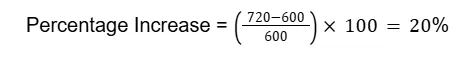
-
Year with Highest Sales for Product C:
-
From the table, the highest sales for Product C is in 2022 with 300 thousand.
-
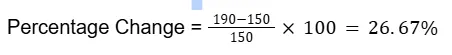
Percentage Change in Sales of Product A from 2019 to 2022:
-
Sales of Product A in 2019: 150
-
Sales of Product A in 2022: 190
-
Percentage change:
Advantages of Tabular Graphs in Data Interpretation
-
Clarity and Precision: Tables provide exact numerical data, ensuring clarity and precision without the need for estimation or approximation.
-
Ease of Comparison: Data presented in rows and columns makes it easy to compare different data points, whether they are across categories or over time.
-
Comprehensive Information: Tables can display a large amount of detailed information in a compact space, making it easy to view and analyze multiple data points simultaneously.
-
Organization: Data is well-organized, with clear headings and subheadings, allowing for quick identification and retrieval of specific information.
-
Flexibility: Tables can handle various types of data, including numerical, categorical, and textual data, making them versatile for different types of analyses.
Disadvantages of Tabular Graphs in Data Interpretation
1. Lack of Visual Appeal:
-
Tables can be less engaging and visually appealing compared to charts and graphs, making it harder to quickly grasp the overall trends and patterns.
2. Difficulty in Identifying Trends:
-
It can be challenging to identify trends, especially over a large dataset, as the data points are not visually connected.
3. Overwhelming with Large Data Sets:
-
Large tables with extensive rows and columns can become overwhelming and difficult to read, leading to information overload.
4. Limited Immediate Insight:
-
Tables require careful reading and interpretation, which can be time-consuming. Charts and graphs often provide quicker insights.
5. Complex Comparisons:
-
Comparing data points across multiple dimensions in a table can be complex and less intuitive than in visual representations.
Previous Year Questions Of Tabular DI Asked In Banking Exams
Directions (1 - 5): Read the following information carefully and answer the questions given below it.
Table graph given below shows the number of Sanitizers sold by 4 companies i.e., A, B, C and D in 2021 and 2022.
|
Companies |
2021 |
2022 |
|
A |
230 |
240 |
|
B |
350 |
380 |
|
C |
310 |
390 |
|
D |
270 |
310 |
1. Find the difference between the total number of Sanitizers sold by companies A and B together in 2022 with the number of Sanitizers sold by D in both years combined?
a) 60
b) 40
c) 30
d) 50
e) None of these
Answer: B
Total number of sanitizers sold by companies A and B together in 2022 = 240 + 380 = 620
Total number of sanitizers sold by D in both years together = 270 + 310 = 580
Required difference = 620 - 580 = 40
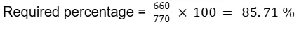
2. Find the number of sanitizers sold by company B and C together in 2022 is what percent of sanitizers sold by them in 2021.
a) 60 %
b) 84.71 %
c) 85.71 %
d) 85 %
e) None of these
Answer: C
Total number of sanitizers sold by companies B and C together in 2021 = 350 + 310 = 660
Total number of sanitizers sold by companies B and C together in 2022 = 380 + 390 = 770
3. Find the difference between the average number of sanitizers sold in 2021 and in 2022.
a) 50
b) 44
c) 60
d) 40
e) None of these
Answer: D
Total sanitizers sold in 2021 = 230 + 350 + 310 + 270 = 1160
Average number of sanitizers sold in 2021 = 1160/4=290
Total sanitizers sold in 2022 = 240 + 380 + 390 + 310 = 1320
Average number of sanitizers sold in 2022 = 1320/4=330
Required difference = 330 - 290 = 40
4. Find the percentage increase in sanitizers sold in the year 2022.
a) 13.79 %
b) 14%
c) 20 %
d) 25 %
e) None of these
Answer: A
Total sanitizers sold in 2021 = 230 + 350 + 310 + 270 = 1160
Total sanitizers sold in 2022 = 240 + 380 + 390 + 310 = 1320

5. Find the number of sanitizers sold by company A and company B in both years is more or less the number of sanitizers sold by company C and company D in both years.
a) 50
b) 70
c) 80
d) 88
e) None of these
Answer: C
the number of sanitizers sold by company A and company B in both years = 230 + 240 + 350 + 380 = 1200
the number of sanitizers sold by company C and company D in both years = 310 + 270 + 390 + 310 = 1280
Required difference = 1280 - 1200 = 80
Tabular Data Interpretation Questions for IBPS RRB Bank Exams FAQs
1. What is tabular data interpretation?
2. Why is tabular DI important in banking exams?
3. What types of questions are asked in tabular DI?
4. How can I improve my skills in solving tabular DI questions?
5. How much time should I spend on tabular DI questions in an exam?