Production Possibility Curve, Definition, Features, Example

The production possibility curve is used to evaluate the efficiency of a manufacturing system. This blog will discuss the production possibility curve. Continue reading!
When two commodities are created simultaneously in a business, the management employs a production possibility curve to plan the optimum percentage of items to decrease waste and expenses while maximizing revenues.
The production possibility curve describes the units of items that a corporation can generate provided all the resources are employed efficiently. Therefore, a single commodity’s maximum manufacturing probability is placed on the X-axis and that of the other commodity on the Y-axis.
Production Possibility Curve Definition
A Production Possibility Curve (PPC), often called a PPF (Production Possibility Frontier), is a graphical representation used in economics to show the various combinations of two goods or services an economy can produce efficiently. This curve illustrates an economy's trade-offs when allocating its limited resources between producing different goods. It helps us understand the concept of scarcity and the opportunity cost of choosing one option over another.
In simpler terms, think of it as a roadmap that displays the choices a country, business, or individual can make when deciding what to produce. The PPC shows the maximum output achievable given the available resources and technology.''
Features of Production Possibility Curve
The Production Possibility Curve (PPC), an important concept in economics, exhibits several key features:
Resource Allocation: It showcases how resources are distributed among various goods or services.
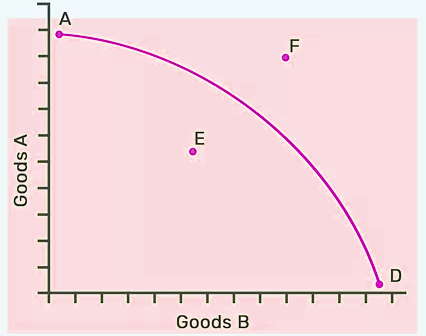
Efficiency: Points on the curve represent efficient resource utilization, while points inside indicate inefficiency.
Opportunity Cost: Demonstrates the trade-off between producing one good over another.
Scarcity Awareness: Highlights the limited nature of resources and the need for choices.
Slope: The curve's slope signifies the changing opportunity cost between goods.
Concave Shape: Typically curved due to differing resource suitability for various productions.
Maximum Output: Depicts the highest output attainable under given constraints.
Future Planning: Helps in planning resource allocation for optimal results.
Dynamic Nature: Can shift due to technological advancements or resource changes.
Economic Growth: An outward shift indicates an economy's growth potential.
Inefficiency Indication: Points below the curve suggest underutilized resources.
Unattainable Points: Points outside the curve signify unachievable production levels.
Also Read: Understanding the Government’s Role in Economy
Assumptions of Production Possibility Curve
The assumptions provided below serve as the basis for analyzing an economy's production choices and resource allocation:
Fixed Resources: The PPC assumes that the quantity and quality of resources, such as labor, capital, and technology, remain constant.
Technology Consistency: It assumes a uniform level of technology throughout the analysis period.
Two-Goods Economy: The model simplifies by considering only two goods or services, which helps in visualizing trade-offs more effectively.
Resource Efficiency: All resources are used efficiently with no waste or idleness.
Full Employment: It assumes that the economy operates with full employment, meaning all available labor is actively engaged.
Production Trade-offs: The PPC assumes that resources can be shifted between the production of two goods, illustrating the trade-offs in output.
Stability: It assumes a stable economic environment, with no sudden shocks or changes during the analysis.
Constant Preferences: The preferences and desires of consumers remain unchanged throughout the analysis.
Time Frame: The PPC typically represents a snapshot of the economy at a specific point in time, ignoring long-term changes.
Shape of a Production Possibility Curve
It is concave and comes downwards to the point of origin. It is concave-shaped since more and more units of one product/commodity are sacrificed to acquire an extra unit of another commodity. It slopes downwards due to the few units we sacrifice for the others, since there exists a reciprocal relationship between the change in the amount of one item and the change in the total amount of the other commodities.
Production Possibility Curve Examples
Example 1:
Imagine an economy that produces only two goods: wheat and rice. The PPC for this economy would illustrate the trade-off between producing wheat and rice.
In this case, let's assume the country has a fixed amount of arable land and labor. The PPC would look like this:
The x-axis represents the quantity of wheat produced.
The y-axis represents the quantity of rice produced.
The PPC would typically be a bowed-out curve, sloping downward from left to right. It starts at a point where all resources are dedicated to producing rice (maximum rice production), and no wheat is produced. As resources are shifted to wheat production, the opportunity cost increases. The curve shows the maximum attainable combinations of wheat and rice production based on available resources and technology.
Example 2:
Consider a nation allocating resources between healthcare services and education. The PPC here represents the choices between investing in healthcare facilities and education infrastructure.
In this scenario, the PPC illustrates the allocation of resources between healthcare and education. Let's assume:
The x-axis represents the quantity of healthcare services.
The y-axis represents the quantity of education services.
The PPC might show a similar bowed-out curve, indicating trade-offs. Starting at a point with maximum healthcare services and no education, it gradually transitions to a point with maximum education and no healthcare. Points in between represent various trade-off combinations between the two sectors.
Production Possibility Curve FAQs
What does a downward-sloping PPC indicate?
How is opportunity cost calculated on a PPC?
Why is the PPC concave-shaped?
What does a point inside the PPC signify?
Can a country or a business produce beyond its PPC?


Get Free Counselling Today
and Clear up all your Doubts