Scatter Diagram - Meaning, Types, FAQs
Share
Scatter Diagrams are simple mathematical techniques to analyze the association between two random variables. As the name implies, they are a kind of a sheet of paper onto which the data points matching to the variables of interest, are spread. Based on the form of the pattern that the data points produce on this sheet of paper, we may identify the link between the two variables, and can further use the most applicable correlation analysis approach.
Scatter Diagram Meaning
A scatter diagram, also known as a scatter plot or scatter graph, is a graphical representation of data using a Cartesian coordinate system. It visually displays individual data points to showcase the values collected for two independent variables. In this type of diagram, one variable is plotted along the X-axis (horizontal axis) while the other variable is plotted along the Y-axis (vertical axis). By illustrating the relationship between these variables through intersecting data points, a scatter diagram facilitates visual analysis and understanding of their correlation.
Different Types of Scatter Diagrams
While there are several ways to represent data using scatter diagram, each suggesting different forms of correlation, the most common and significant types are detailed below.
Perfect Positive Correlation:
A scatter diagram exhibits a perfect positive correlation when all plotted points align precisely along a straight line on a graph. This is visually depicted as a line ascending from the lower-left corner to the upper right corner.
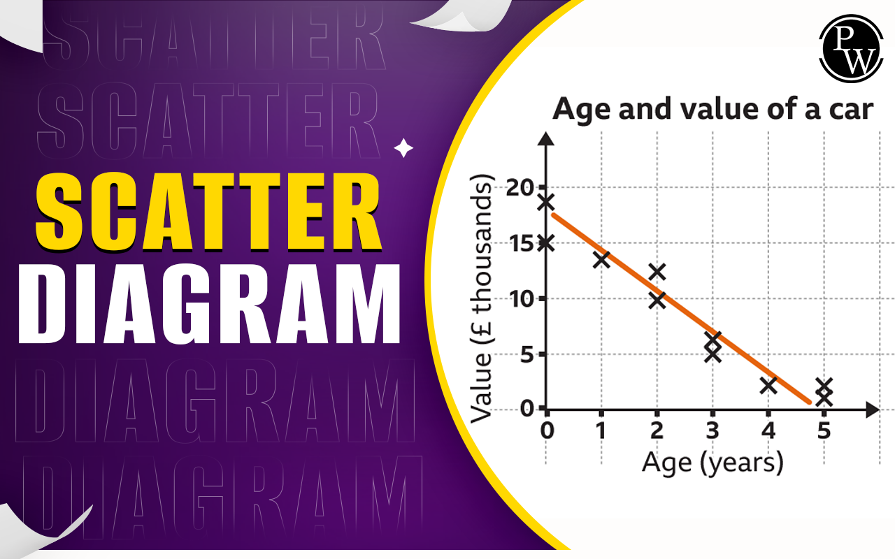
Perfect Negative Correlation:
Conversely, a perfect negative correlation in a scatter diagram is the opposite of the previous type. Here, all data points form a straight line, but it descends from the top left corner to the bottom right corner.
High Degree of Positive Correlation:
If the correlation is strong, the plot looks as a band that begins from the bottom left of the graph to the top right.
High Degree of Negative Correlation:
Similar to perfect correlations, high degrees of positive and negative correlation are inverses of each other. In the case of a high degree of negative correlation, every plotted point forms a band descending from the top left corner to the bottom right corner.
Low Degree of Positive Correlation:
When there is a low degree of correlation, positive or negative, the plotted points are scattered. In low positive correlation, despite being scattered, these points exhibit a slight tendency to rise from the lower left corner to the upper right corner.
Low Degree of Negative Correlation:
Similarly, in cases of low negative correlation, the scatter points are dispersed, but there is a general tendency for them to fall from the top left corner to the bottom right corner.
No Correlation:
Scatter diagrams serve to determine the relationship between variables, and incoherent, scattered representations indicate a lack of correlation between two variables. In such instances, the plotted points are randomly dispersed across the graph.
How to Create a Scatter Diagram
Constructing a scatter diagram is relatively easier when using an Excel spreadsheet compared to manual data table creation on paper. However, the same fundamental steps are followed in both methods.
Record Data:
Present the data in tabular form, whether in Excel or on paper, with both variables and their respective values, along with the data range.
Graph Creation:
Draw a graph with the independent variable on the x-axis and the dependent variable on the y-axis.
Data Plotting:
Place a point on the graph where the values of both variables intersect.
Pattern Observation:
Examine the pattern formed by the points. If the dots align to create a distinct line or curve, it suggests a correlation between the variables.
Quadrant Analysis:
Start by dividing the graph into four equal parts, known as quadrants. Then, carefully analyze and evaluate the data points within each quadrant. Finally, calculate the total number of points present in each quadrant.
Comparing Quadrants:
To compare the various quadrants, start by finding the total number of dots in the upper left and lower right quadrants (A). Then, calculate the sum of dots in the upper right and lower left quadrants (B).
Calculate Q and N:
Determine the smaller sum, Q (the minimum of A and B), and the total number of dots, N (A + B).
Interpretation:
Analyze the table to understand the relationship between the variables. If Q < N, it suggests a correlation between the variables. However, if Q ≥ N, the observed pattern is likely due to chance.
Scatter Diagram FAQs
What is the Use of a Line Graph?
How is a Scatter Diagram Created?
What is the Purpose of a Scatter Diagram?
What is Data Representation in Statistics?
Difference Between Bar Chart and Histogram?