
CBSE Class 8 Maths Notes Chapter 4 Data Handling PDF Download

CBSE Class 8 Maths Notes Chapter 4: Chapter 4 of CBSE Class 8 Maths, "Data Handling," introduces students to organizing and interpreting data. It covers different types of data, such as raw and grouped data. The chapter teaches how to represent data visually using bar graphs, pie charts, and histograms.
Students also learn about measures of central tendency, including mean, median, and mode, as tools to summarize data. Additionally, the chapter covers probability basics, helping students understand the likelihood of events. The chapter builds foundational skills in collecting, presenting, and analyzing data effectively for better decision-making.CBSE Class 8 Maths Notes Chapter 4 Overview
Chapter 4 of CBSE Class 8 Maths, "Data Handling," focuses on collecting, organizing, and interpreting data in meaningful ways. It begins by explaining the concept of raw and grouped data, helping students understand how data can be arranged for clarity and better analysis. This chapter emphasizes the importance of data representation through visual tools like bar graphs, pie charts, double bar graphs, and histograms, which make it easier to compare and analyze data. The chapter also delves into measures of central tendency, such as mean, median, and mode, which provide a summary of data sets. These measures are essential for identifying patterns, trends, or central points in the data. Mean gives the average, the median gives the middle value, and mode shows the most frequent value. Understanding these helps in comparing and interpreting different data sets.CBSE Class 8 Maths Notes Chapter 4 PDF Download
Here we have provided CBSE Class 8 Maths Notes Chapter 4 Data Handling for the ease of the students so that they can download these solutions and access them without internet -CBSE Class 8 Maths Notes Chapter 4 PDF
CBSE Class 8 Maths Notes Chapter 4 Data Handling
Below we have provided CBSE Class 8 Maths Notes Chapter 4 Data Handling - Students will study about organizing and presenting data using pictographs, bar graphs, double bar graphs, and pie charts in Class 8 Chapter 5 on data handling. Additionally, with the aid of examples from real life, students will encounter the concepts of chance and probability.What is Data handling?
The process of arranging the given data so that mathematical operations can be carried out on it is known as data management. It entails gathering the unprocessed data and putting it in a specific format. This data may be expressed in words, numbers, or any other format. Generally speaking, there are two categories of data:- Qualitative Data
- Quantitative Data
Pie Charts
The link between a circle's components and its whole is displayed in a pie chart. There are sectors on the circle. Each sector's size corresponds to the information it contains. Circle graphs are another name for pie charts.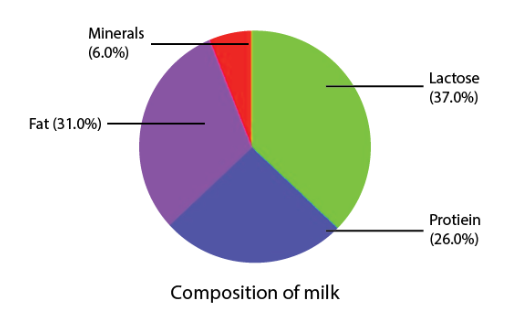
Creating Different Pie Charts
The following procedures must be followed in order to create a pie chart: Determine the fraction or portion that each list of items or activity represents. Multiply each fraction by 360° to convert it to degrees. Make a circle and segment it into several areas. Every sector's centre angle equals the previously determined fraction of 360°.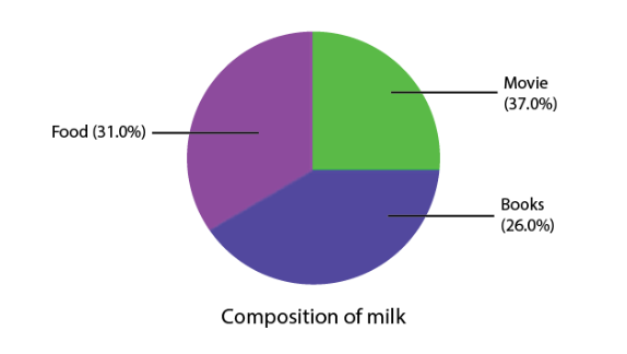 Each sector in the pie chart is proportional to the amount spent for that particular activity or item.
Introduction to Data Handling
Raw Data
Primary data, sometimes referred to as raw data, is accessible in an unstructured format. Here are some instances of raw data: grades for each student in a class An index of music videos available on a channel player scores during a cricket matchOrganisation of Raw Data
Unorganised raw data is present. We arrange data in order to make relevant deductions. We can arrange data in many different ways. We can use bar graphs, frequency distribution tables, and other tools to organise raw data, for instance. View the example below to get a sense of how the data is organised.Pictographs
A pictograph is a data representation employing symbols in a visual format. As an illustration, suppose that 10 apples were sold in January, 40 in February, 25 in March, and 20 in April. The provided data can be represented as a pictograph as shown below: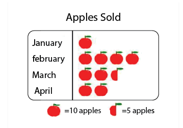
Scale Factor
The length of one figure's side divided by the length of the equivalent side of the other figure is known as the scale factor. When creating maps, the scale factor is utilised. The ratio of a distance on a map to its actual distance on the ground is known as the map's scale.Bar Graphs
A bar graph is a visual representation of data made up of rectangular bars with heights proportionate to the values they represent. For instance, the number of pupils who passed and failed each year is depicted in the bar graph below, which displays the results in a school.Multiple Bar Graphs
Multiple bar graphs is a bar graph which is used for comparing more than one kind of information. Example: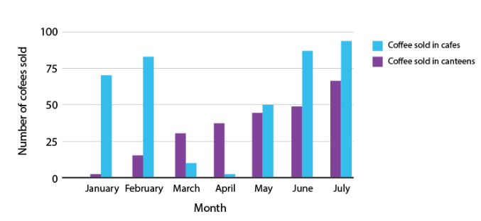 A double bar graph is seen in the above illustration. In cafes and canteens, it displays the quantity of coffee served during the months of January, February, March, April, May, June, and July.
Grouped Data
Frequency
The number of times a specific observation or event occurs is its frequency. For instance, the frequency of 60 to 70 marks is four if four students received those scores.Grouped Frequency Distribution
A vast amount of raw data is represented in a grouped frequency distribution by grouping or class intervals, and then the frequency distribution of the number of observations falling into each group is obtained. The class 10th students' marks (out of 100) are listed below: 93,98,87,65,75,77,67,88,67,97,72,73,75,90. The above data can be represented as a frequency distribution table:| Marks | Frequency |
| 60-70 | 3 |
| 70-80 | 5 |
| 80-90 | 2 |
| 90-100 | 4 |
Class width or size = upper limit – lower limit
Note: In that class interval, the value equal to the upper limit is excluded. The next higher class interval includes it. For instance, in this instance, the number 90 is included in the class interval 90-100 rather than the class interval 80-90.Tally Marks
Data are represented and counted using tally marks. In tally markings, each of the first four numbers is represented by a single vertical line, while the fifth number is denoted by a diagonal line that crosses the preceding four. The tally marks for numbers 1 through 10 are displayed in the table below.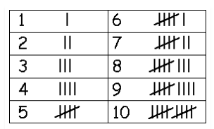
Histogram
One kind of bar diagram is a histogram, where: The class intervals are shown by the horizontal axis. The height of the bars indicates the frequency of the class interval. There is no gap between the bars since there isn't one between the class intervals.Equally Likely Outcomes
Random Experiment
An experiment in which it is impossible to predict the outcome with precision is called a random experiment. Dice rolling is one example.Experiment and Outcomes
Any process that has a well-defined collection of potential outcomes, referred to as the sample space, and may be repeated indefinitely is considered an experiment. An event is made up of all the results of an experiment or of a group of results. Rolling a die, for instance, is an experiment. When a die is rolled, an event occurs if the result is 1, 2, 3, or even.Equally Likely Outcomes
Two outcomes are equally likely if they have an equal probability of happening. For instance, when you toss a coin, the odds of obtaining a head or a tail are equal.Probability of an Event
The possibility that an event will occur is known as probability. An event is a collection of experiment results. The probability of an event where all experiment results are equally likely is given by:Experimental Probability
There is only one possible result when we toss a coin: either head or tail. There is a 0.5 chance of receiving a head or a tail. It's not a given that we will throw a coin ten times and receive heads five times and tails five times. Consequently, we determine the experimental or empirical probability based on what we see as the results of our trials. Probability that is empirical or experimental: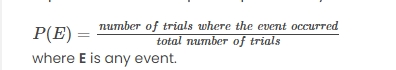
Benefits of CBSE Class 8 Maths Notes Chapter 4
The benefits of CBSE Class 8 Maths Notes Chapter 4 "Data Handling" are numerous, providing foundational skills that are valuable in academics and real-life scenarios. Key benefits include:Improved Analytical Skills : By organizing and interpreting data, students develop critical thinking and analytical skills, allowing them to better understand patterns and trends.
Efficient Data Representation : Learning various methods of data representation such as bar graphs, pie charts, and histograms helps students present data clearly, making complex information easier to interpret.
Understanding Central Tendencies : Concepts like mean, median, and mode help students summarize data sets efficiently, allowing for easier comparisons and interpretations of large data sets.
Foundation for Probability : Basic probability introduced in this chapter teaches students how to assess the likelihood of different outcomes, a key skill in various fields like statistics, economics, and science.
Real-World Application : Data handling is an essential skill in everyday life, from managing finances to analyzing sports statistics. Understanding data helps in making informed decisions.
CBSE Class 8 Maths Notes Chapter 4 FAQs
Which is the hardest chapter in maths class 8?
What are the important definitions of data handling class 8?
What is data handling in short notes?
Why is data handling important in math?