







PW Class 6 Maths Notes Chapter 4: Data Handling
 Neha Tanna5 Sept, 2026
Suppose you want to find out which colours your classmates prefer. Collecting their answers gives you information, but a list of responses alone may not be easy to read. Arranging those responses in a table or representing them visually makes comparisons much clearer.
The PW Class 6 Data Handling Notes take you through this process using tables, tally marks, pictographs, and bar graphs. The chapter also shows how data can be collected systematically and then presented in different forms so that patterns and comparisons are easier to understand.
What Is Data Handling?
Data handling refers to the process of collecting, organising, and presenting data so that it can be analysed and understood effectively.
It involves:
-
Exploring patterns
-
Drawing comparisons
-
Presenting information visually
The process begins with gathering information and then arranging it in a form that makes the data easier to understand.
How Is Data Collected and Organised?
Data collection means gathering information systematically. Examples include:
-
Counting the number of students who like particular fruits
-
Recording daily temperatures over a week
Once the information has been collected, it needs to be arranged systematically. We introduce tables and tally marks for this purpose.
How Are Tables Used to Organise Data?
A table provides a simple tabular format for displaying information clearly. Categories and their corresponding information can be arranged together, making the collected data easier to read.
What Are Tally Marks?
Tally marks provide a quick and efficient way to count and group data.
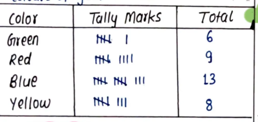
We demonstrate this using information collected about the favourite colours of classmates.
|
Colour |
Total Number of Students |
|
Green |
6 |
|
Red |
9 |
|
Blue |
13 |
|
Yellow |
8 |
Once these responses are counted and organised, the same information can also be represented visually.
What Is a Pictograph?
A pictograph uses pictures or symbols to represent data. Each picture corresponds to a specific number, providing a visual representation of the quantities.
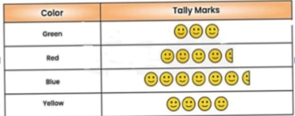
In the favourite-colours example given in the notes:
🙂 = 2 students
A half symbol represents 1 student.
This allows the totals already collected for Green, Red, Blue, and Yellow to be shown through symbols instead of only through numbers.
How Is a Pictograph Created?
A pictograph is created in the following steps:
-
Decide the symbol or picture that will represent the data.
-
Assign a value to each symbol.
-
Use the symbols to represent the quantities.
The value assigned to the symbol is important because it tells you how many items or people each picture represents.
What Is a Bar Graph?
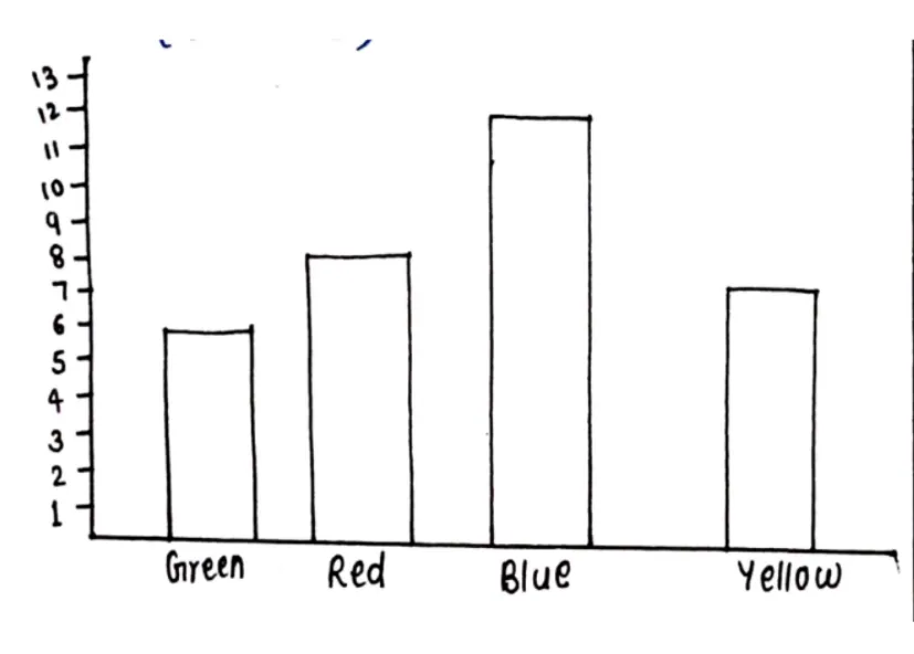
A bar graph uses rectangular bars to show comparisons among categories. The height or length of each bar is proportional to the value it represents. The same favourite-colours data used in the table and pictograph can also be displayed as a bar graph.
How Is a Bar Graph Drawn?
We outline four steps:
-
Collect and organise the data.
-
Label the axes. The x-axis represents categories, while the y-axis represents values.
-
Choose a scale for the y-axis.
-
Draw bars of equal width for each category, making sure their heights correspond to the values.
How Is the Favourite-Colours Data Shown on a Bar Graph?
For the example:
-
X-axis: Colours; Green, Red, Blue, and Yellow
-
Y-axis: Number of students
The bar heights represent the values already recorded in the table:
|
Colour |
Number of Students |
|
Green |
6 |
|
Red |
9 |
|
Blue |
13 |
|
Yellow |
8 |
The bar graph therefore presents the same collected information visually, with each bar corresponding to one colour and its number of students.
PW Class 6 Maths Notes Chapter 4: Data Handling PDF
Study without using the internet
How Can PW Class 6 Notes Help You Revise Data Handling?
The PW Class 6 Data Handling Notes help you understand how information changes from raw data into a form that is easier to read and compare. You can revise each stage separately and then see how they connect.
-
Understand How Data Is Collected
Begin with the information you want to record. For example, you may collect data about the favourite colours of a group of students.
-
Count Data Using Tally Marks
Use tally marks to count and group the responses. This makes it easier to find the total for each category before arranging the information further.
-
Read Data Through Tables and Pictographs
A table keeps the totals organised, while a pictograph uses pictures or symbols to represent them. PW notes help you revise how the same values can be read in both forms.
-
Compare Data with a Bar Graph
A bar graph makes comparison more visual. Categories are placed on the x-axis, values are shown on the y-axis, and the height of each bar represents its value.
With PW, you can revise data handling in a clear order, from collecting and counting data to organising and presenting it visually.
Complete PW Resources for Class 6 Maths Preparation
After going through the PW Class 6 Data Handling Notes, you can use other PW Class 6 Maths resources as you move from concept revision to question practice.
|
PW Class 6 Resource |
How You Can Use It |
|
Refer to chapter-wise concepts and explanations |
|
|
Check solutions to questions from your NCERT textbook |
|
|
Practise important questions after revising the chapter |
|
|
Work on questions covering different Class 6 Maths chapters |
Data handling is about making collected information easier to organise, compare, and understand. The PW Class 6 Data Handling Notes show this process through tables, tally marks, pictographs, and bar graphs, allowing you to see how the same set of information can be presented in different forms during revision.
CBSE Class 6 Maths Notes Chapter 4 FAQs
1. How can PW Class 6 Data Handling Notes help you organise information?
2. How do tally marks make collected data easier to read?
3. How is the same data represented in a pictograph and a bar graph?
4. What should you remember when drawing a bar graph?














 Live & recorded classes available at easeDashboard for progress trackingMillions of practice questions at your fingertips