RS Aggarwal Solutions for Class 8 Maths Chapter 21 Data Handling
Share

RS Aggarwal Solutions for Class 8 Maths Chapter 21: RS Aggarwal Solutions for Class 8 Maths Chapter 21 Data Handling help students learn how to collect, organize and display data in charts and graphs. This chapter includes topics like making bar graphs, pie charts, and histograms to show information clearly.
By using these solutions students can practice interpreting data and understanding how to present it effectively. The step-by-step explanations make it easier to solve problems and improve skills in handling data. These solutions are useful for studying and doing well in exams.RS Aggarwal Solutions for Class 8 Maths Chapter 21 Data Handling Overview
RS Aggarwal Solutions for Class 8 Maths Chapter 21 Data Handling, are prepared by subject experts of Physics Wallah to provide a thorough understanding of data representation. This chapter focuses on essential techniques for organizing and interpreting data using various graphical methods like bar graphs, pie charts, and histograms. The solutions provide detailed steps and explanations to help students grasp how to collect, organize, and present data effectively. With these expert-prepared solutions, students can build a strong foundation in data handling.RS Aggarwal Solutions for Class 8 Maths Chapter 21 PDF
Here we have provided the RS Aggarwal Solutions for Class 8 Maths Chapter 21 on Data Handling to assist students in their exam preparation. This chapter focuses on understanding and managing data through various methods and representations. It covers key concepts such as organizing raw data into frequency distribution tables, using bar graphs and pie charts, and interpreting grouped data. The solutions in this chapter help students grasp how to systematically handle and present data, which is important for analyzing and drawing meaningful conclusions. By working through these exercises, students will improve their skills in data organization, representation and interpretation, enhancing their overall proficiency in handling data and preparing them for more advanced topics in statistics and probability.| RS Aggarwal Solutions for Class 8 Maths Chapter 21 Data Handling |
| RS Aggarwal Solutions for Class 8 Maths Chapter 21 Exercise 21.1 |
| RS Aggarwal Solutions for Class 8 Maths Chapter 21 Exercise 21.2 |
Data Handling
Data Handling is a crucial concept in mathematics, particularly for Class 8 students, as it lays the foundation for understanding more complex topics like statistics and probability. This chapter helps students learn how to manage and interpret data effectively.Key Concepts in Data Handling:
Raw Data: This is the initial, unorganized collection of information. For example, if students record their favorite ice cream flavors without any structure, this is raw data.
Organizing Data: To make raw data useful it must be organized systematically. This involves creating frequency distribution tables and grouping data.
Frequency: This refers to the number of times a particular entry appears in the dataset. For instance, if 10 students like vanilla ice cream, the frequency for vanilla is 10.
Grouped Frequency Distribution: When dealing with large datasets, data is grouped into intervals or classes to simplify analysis. For example, test scores might be grouped into ranges like 0-10, 10-20, etc.
Histograms: These are graphical representations of grouped data. Bars of varying heights show the frequency of data within each interval.
Pie Charts: Also known as circle graphs, these show data proportions as slices of a circle. Each slice represents a category's contribution to the whole.
Pictographs: Data is represented using pictures or symbols. Each symbol corresponds to a specific number of units.
Bar Graphs and Double Bar Graphs: Bar graphs use bars to show data values, while double bar graphs compare two sets of data side by side.
Example of Data Handling:
Imagine a survey where students choose their favorite ice cream flavor. The raw data might look like this: Strawberry, Vanilla, Chocolate, Strawberry, etc. To analyze this data, you would first count how many students chose each flavor and then organize this information into a frequency distribution table. This table can be used to create bar graphs or pie charts for visual representation.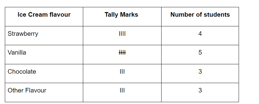 By mastering these concepts students can effectively analyze and present data, enhancing their understanding and application of mathematical concepts.
RS Aggarwal Solutions for Class 8 Maths Chapter 21 Data Handling Exercise Introduction
RS Aggarwal Solutions for Class 8 Maths Chapter 21 Data Handling Exercise 21.1 (Ex-21A): Exercise 21.1 introduces students to the basics of data handling. This exercise focuses on organizing and interpreting raw data. It aims to develop skills in creating frequency distribution tables and representing data visually through bar graphs.
Key Topics Covered:
Frequency Distribution Table: Students are required to create frequency distribution tables from raw data. For instance, given a list of students test scores, students will group these scores into intervals and count how many scores fall into each interval.
Bar Graphs: This part involves converting the frequency distribution data into bar graphs. Students will draw bar graphs where each bar represents the frequency of data in a particular interval.
RS Aggarwal Solutions for Class 8 Maths Chapter 21 Data Handling Exercise 21.2 (Ex-21B): Exercise 21.2 expands on the concepts introduced in Exercise 21.1 by introducing grouped data and more complex graphical representations. This exercise helps students handle and interpret data that is already organized into groups and teaches how to represent data using pie charts.
Key Topics Covered:
Grouped Data: Students work with data that has already been grouped into intervals. They analyze and interpret this grouped data, calculating frequencies and percentages.
Pie Charts: This section requires students to represent data using pie charts. They will learn how to convert frequency data into angles for pie charts and how to draw and interpret these charts.
Benefits of RS Aggarwal Solutions for Class 8 Maths Chapter 21
- Clear Understanding : The solutions provide step-by-step explanations for each exercise, helping students understand the process of organizing, representing and interpreting data.
- Concept Reinforcement : By working through these solutions students can reinforce their understanding of important concepts like frequency distribution, bar graphs, pie charts, and grouped data.
- Visual Learning : The chapter includes visual aids like bar graphs and pie charts, which help students better understand how to represent data visually and interpret graphical information.
- Preparation for Exams : The solutions are designed to align with the curriculum making them a valuable resource for exam preparation. They help students practice and master the types of questions likely to appear in exams.
- Confidence Building : With detailed solutions and explanations students can build their confidence in handling data-related questions, reducing anxiety and improving performance.
RS Aggarwal Solutions for Class 8 Maths Chapter 21 FAQs
What is Data Handling?
What is a Frequency Distribution Table?
What is the Difference Between a Histogram and a Bar Graph?
What is a Class Interval?
What is Frequency?