CBSE Class 9 Maths Notes Chapter 14 Statistics
Share

CBSE Class 9 Maths Notes Chapter 14: The study of statistics calls for extensive preparation, commitment, and practice. The revision notes for Class 9 Maths Chapter 14 Statistics are provided by us to aid students in recalling and reinforcing the key ideas covered in the chapter.
These revision notes are based on the most recent CBSE Syllabus and cover all of the chapter's main subjects. Students can profit from the Class 9 Maths Chapter 14 Statistics revision notes by using them to help with last-minute exam preparation. Through the PDF link provided below, students can obtain the review notes for Statistics Class 9 Maths Chapter 14.CBSE Class 9 Maths Notes Chapter 14 Overview
Here we have provided CBSE Class 9 Maths Notes Chapter 14 for the students so that by our notes they can easily understand concepts present in the chapter. The notes can be used by students at any place or at any time. Students can download them and then access them anywhere. Topics covered in this chapter are --
Introduction to Statistics
-
Collection of Data
-
Presentation of Data
-
Graphical Representation of Data - Bar Graph, Histogram, and Frequency Polygon
CBSE Class 9 Maths Notes Chapter 14 PDF
Students will improve their ability to reason clearly and solve problems appropriately by studying this chapter. It is designed to provide a solid basis for building tables, utilizing data, and obtaining information. As a result, the students will be exposed to maintain data. Here we have provided CBSE Class 9 Maths Notes Chapter 14 PDF.CBSE Class 9 Maths Notes Chapter 14 PDF
CBSE Class 9 Maths Notes Chapter 14
Statistics is a discipline of mathematics that deals with the gathering, organizing, analyzing, and interpreting of data or information. The communication and statistical analysis of facts and numbers is the primary focus of statistics. The statistical approach is used for data collection, classification, tabulation, representation, testing, reasoning, and inference drawing. The tools used in statistical procedures include graphs, tables, inference, estimation, and prediction. Prominent Indian statisticians are Prof. C.R. Rao and DR. P.K. Bose III. Estimates and projections are aided by statistics. Rainfall patterns of a certain city during a given period can be analyzed with the use of figures (data) gathered throughout time, and a reasonable projection regarding the upcoming season can be formed.The word statistics can be used with two meanings.
-
Collecting data in systematic form and presenting numerical data
-
Processing the numerical data and finding conclusions
The following figure shows some information about the population. See the figure and try to answer the questions below it.
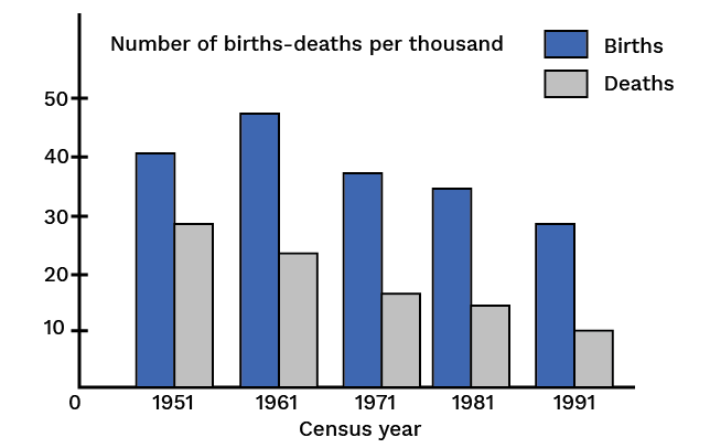
What information about the population does the figure represent?
-
Find the time interval in which the information has been collected.
-
The time interval is divided into how many parts? How many years does each part contain?
-
From the figure can you say that the birth rate is constantly declining?
-
From the figure can you say that the death rate is constantly declining?
-
Write the census year which shows the maximum birth rate. How much is it?
-
Find the time interval in which the death rate has fallen suddenly
The statistical method of studying a problem mainly consists of the following steps:
-
To collect numerical data about the situation or problem
-
To present the collected data systematically
-
To analyze the data
-
To interpret the data and conclude conclusions from it
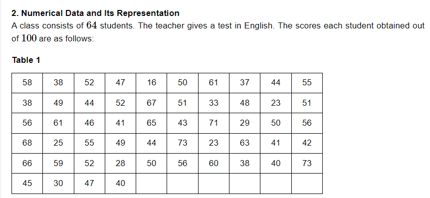 These grades are the numerical information, sometimes known as raw data, that was gathered to determine the English class's level of achievement.
The way the results are shown barely provides any indication of the student's English proficiency. To gain some understanding of the numerical data, it must be presented methodically. There are several approaches to systematic numerical data presentation.
These grades are the numerical information, sometimes known as raw data, that was gathered to determine the English class's level of achievement.
The way the results are shown barely provides any indication of the student's English proficiency. To gain some understanding of the numerical data, it must be presented methodically. There are several approaches to systematic numerical data presentation.
Information Gathered from the Table:
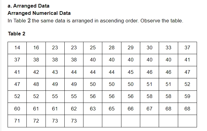
There is a minimum of 14 and a maximum of 73 marks. A few students received identical grades. The maximum number of times the score of 40 has occurred is five.Drawbacks of this Method:
It's an extremely lengthy process. It would take a lot of time to arrange the numerical data in ascending order because it is frequently enormous. We do not obtain any noteworthy information from it, even after executing it. Thus, it becomes vital to present the information in a concentrated form to obtain more.Ungrouped Frequency Distribution Table
The ungrouped frequency distribution of the data in Table 1 is shown in Table 3 below. The following is how the table is set up: Write each number in the data starting with the smallest and going all the way down to the last. Now, place a tally mark, such as this: '|', next to each number to keep note of when it appears more than once. Drawing the fifth mark in this manner involves crossing the first four markings diagonally (||||). This facilitates the counting of tally marks. Place the sixth tally mark somewhat apart from the previous five. The frequency of a number in the data is the total number of tallies or counts that correspond to that number.Grouped Frequency Distribution Table
Using tally marks, the numerical data is divided into manageable groups or classes in this manner. The data is categorized into groups 11 to 20, 21 to 30,..., and 71 to 80 in the table below.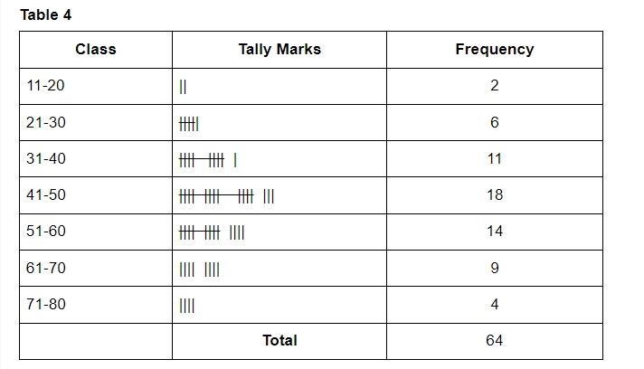
Graphical Representation of Statistical Data
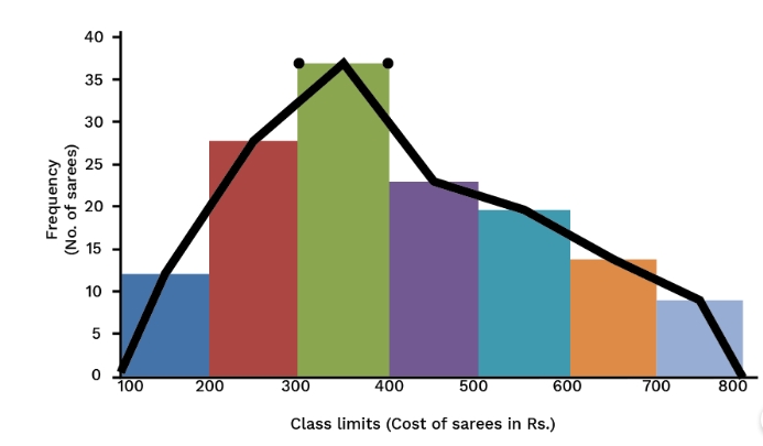
a. Histogram
A 2D representation in graphical form of a continuous frequency distribution is known as a histogram, also a special type of bar diagram.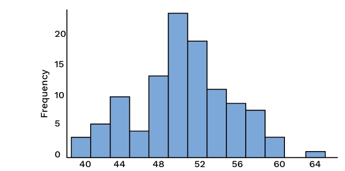 A histogram displays the distribution of the data and provides a visual summary of the data. They are created using a frequency table, which provides an overview of the information. A histogram often has two scales: a horizontal scale that shows the individual intervals, also called classes, and a vertical scale that shows frequencies. Each distinct interval is represented by bars, where the height of the bar reflects the frequency.
Frequency Polygon
Data can be visualized using a frequency polygon, where points are connected the class mark is plotted on the horizontal axis, and the class frequency is plotted on the vertical axis. The next step is to extend the class marks to one class width with a frequency of zero on both ends.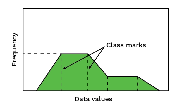 A frequency polygon can be drawn by following the given steps.
- First, using the provided data, create a histogram.
- Create a straight line connecting all of the midpoints of the upper horizontal sides of the rectangles in the histogram.
- It is expected that there are classes in the classification that come before the first class and that come after the last class, with a frequency of zero for each. The midpoints of the upper horizontal sides of the extreme rectangles of the histogram are coupled with the class marks of those classes.
Benefits of CBSE Class 9 Maths Notes Chapter 14
- It will make it simple and quick for students to review all of the chapter's key ideas.
- The notes have been composed in an easy-to-understand manner for the benefit of the pupils.
- It is thought to be a helpful tool for efficiently studying Statistics for the impending Class 9 Maths test.
- Students can assess which area they need to concentrate on more by consulting the notes for Class 9 Maths Chapter 14.
- The Class 9 Maths Chapter 14 notes free pdf explains all pertinent formulas in the chapter with clear illustrations.
CBSE Class 9 Maths Notes Chapter 14 FAQs
Which is the hardest chapter in maths class 9?
What is chapter 14 of maths class 9?
How to score full marks in CBSE Class 9 Maths?