

Introduction to Graph Formula, Bar Graph, Pie Graph, Line Graph

Introduction to Graph Formula: A graph is essentially a structured portrayal of information, aiding in the comprehension of data. Data comprises numerical details garnered from observations.
The term "data" originates from the Latin word "Datum," signifying "something given."
Following the formulation of a research query, a consistent accumulation of data through observation occurs. Subsequently, this data is structured, condensed, categorized, and ultimately depicted in graphical form.
Difference Between Data and Information
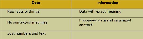
Data stands as the unprocessed reality, lacking embellishments, while information embodies the significance extracted from data.
What are the Different Types of Data?
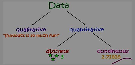
There are two types of Data:
Also Check - Cube Roots Formula
Quantitative Data
Quantitative data refers to statistical or numerical information. It is obtained through various methods such as experiments, tests, surveys, and market reports. Also known as structured data, quantitative data can be further categorized into continuous data and discrete data.
- Continuous Data
Continuous data encompasses values that can span a wide range. This indicates that continuous data can yield an infinite number of outcomes, necessitating grouping before graph representation.
Illustrative Examples:
The velocity of a vehicle as it passes a designated point.
The weight of a cooking apple.
The duration a volunteer takes to complete a task.
- Discrete Data
Discrete data takes on specific, distinct values. This means that only a finite set of numbers can be attributed to discrete data.
Exemplary Instances:
The number of cars sold at a dealership in a given month.
The count of houses within a particular block.
The tally of fish caught during a fishing expedition.
The total complaints received at an airline office on a specific day.
The number of customers visiting a bank within a specific hour.
The count of heads obtained in three coin tosses.
Also Check - Rational Numbers
Distinguishing Discrete and Continuous Data:
Numeric data can be either discrete or continuous.
Continuous data can assume any numerical value within a range, like weight or height.
Continuous data boasts an infinite array of potential values.
Also Check - Linear Equation
Discrete data takes only particular values through defined 'jumps,' without occupying intermediate values (e.g., the number of students in a class).
Download PDF Introduction To Graph Formula
Qualitative
Qualitative data pertains to descriptions or qualities rather than numerical values. It is characterized by its focus on attributes, characteristics, and subjective observations. This type of data is often referred to as unstructured data due to its inherent flexibility and resistance to traditional quantitative analysis methods.
In qualitative data analysis, the emphasis is placed on understanding context, meanings, and patterns within the data, rather than assigning numerical values or measurements. This type of data is commonly gathered through methods such as interviews, focus groups, observations, and content analysis. The goal of qualitative research is to gain insights into the underlying motivations, behaviors, and experiences of individuals or groups.
Unlike quantitative data, which relies on statistical techniques and mathematical calculations, qualitative data analysis involves processes such as coding, thematic analysis, and narrative interpretation. This allows researchers to uncover nuanced insights and capture the complexity of human experiences that may not be easily quantifiable.
Qualitative data is essential in fields such as anthropology, sociology, psychology, and cultural studies, where understanding human behavior and societal dynamics requires a deeper exploration of meanings, perceptions, and context.
Graph Formula
A graph serves as a mathematical depiction of networks, aiming to visually present mathematical connections for enhanced comprehension. Various graph formats exist, encompassing:
- Bar graph
- Pie graph
- Line graph
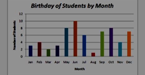
Bar Graph
A bar graph, also known as a bar chart, is a graphical representation of data using rectangular bars or columns. Each bar corresponds to a specific category or data point, and the length or height of the bar is proportional to the value it represents. Bar graphs are commonly used to compare the values of different categories or to display changes in data over time. They provide a visual way to quickly understand and analyze numerical data and patterns.
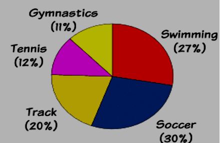
Pie Graph
A pie graph, also known as a pie chart, is a circular graphical representation used to display data proportions or percentages within a whole. The circle represents the total data set, and it is divided into individual "slices" or sectors, each corresponding to a specific category or data point. The size of each slice is proportional to the quantity it represents relative to the whole.
Pie graphs are particularly useful for illustrating the distribution of categorical data and showing how different parts contribute to the overall composition. They offer a visual way to quickly grasp the relative sizes of various components in a data set. The angles of the slices are calculated based on the proportions they represent, making it easy to compare the magnitudes of different categories at a glance.
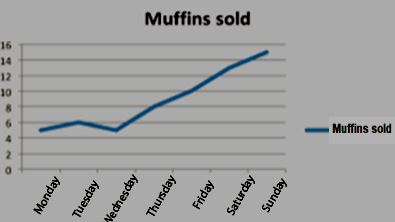
Line Graph
A line graph, also referred to as a line chart, is a graphical representation that displays data points as individual markers connected by lines. This type of graph is commonly used to visualize the relationship between two or more variables and to show how they change over a continuous or discrete period.
In a line graph, one axis typically represents the independent variable (often time) and is known as the x-axis. The other axis represents the dependent variable, and it's known as the y-axis. Data points are plotted at specific values on the graph, and lines are drawn to connect these points. The resulting lines provide a visual depiction of the trend, pattern, or change in the data over the given range.
Line graphs are particularly useful for showing trends, patterns, and fluctuations in data over time or across a range of values. They are commonly used in various fields, including economics, science, finance, and social sciences, to help illustrate how variables are related and how they behave under different conditions.
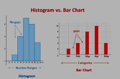
Histogram
A histogram graph illustrates data using rectangular bars of varying heights, with each bar corresponding to a specific range of quantitative values. While it may resemble a bar graph, there exists a crucial distinction between the two. In a histogram, individual columns portray quantitative data ranges, whereas a bar graph is employed for depicting categorical variables .
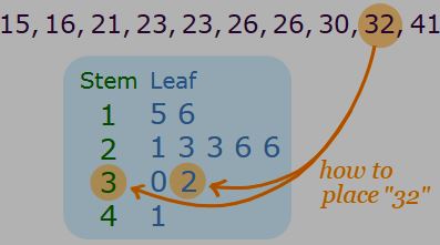
Stem and Leaf Plot
The stem and leaf plot provides a method for displaying quantitative data based on frequency distribution or frequency ranges.
Within the context of a stem and leaf plot, each individual data point is divided into a "stem" and a "leaf." For instance, the number 32 would be divided into three stems and two leaves.
Pictograph
A Pictograph, also known as a Pictogram, is an ancient method of illustrating data through visual symbols or images, each of which symbolizes a specific quantity.
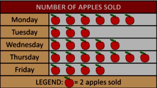
In accordance with the aforementioned Pictograph, it can be deduced that the quantity of Apples sold on Monday is calculated as 6x2=12.
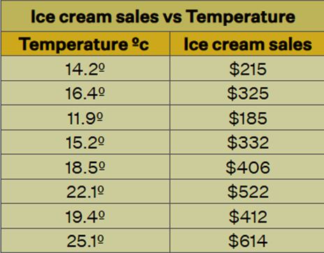
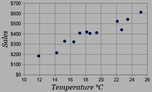
Scatter Diagrams
A Scatter diagram, also referred to as a scatter plot, is a graphical technique that employs Cartesian coordinates to display the correlation between two variables. This plot effectively visualizes the connection between these two variables. Provided below is both a dataset table and a scatter diagram created based on the provided data.
Introduction to Graph Formula FAQs
Define the term data.
What are the two types of data?
What are the different ways to represent a given data?
Give some examples of different graphs.