
Line Graph Data Interpretations, Questions and Solutions
Linde Graph Based Data Interpretations are the questions from line chart form the base of the data interpretation. Get the Line Graph DI Questions and solutions in the article.
Line Graph Data Interpretations: A line graph, also known as a line chart, is a fundamental tool for pictorially representing a set of data. In line graphs, straight line segments connect data points (called markers), illustrating continuous changes over some time. Because the data points display information, line graphs are also referred to as point-to-point graphs.
In data interpretation, line graphs are used to visually represent data points connected by straight lines, demonstrating how a particular variable changes over time or other continuous intervals. Here’s an overview of their features and uses:Key Concepts of Line Graph Data Interpretation
- Axes:
- X-axis: Represents the independent variable, often time (e.g., days, months, years).
- Y-axis: Represents the dependent variable, which changes in response to the independent variable (e.g., sales, temperature, stock prices).
- Data Points (Markers) : Individual measurements or values that are plotted on the graph.
- Line Segments: Connect the data points, showing the trend or pattern over the interval.
Tricks to Solve Line Graph DI
- Highlight Important Points: Mark key data points and trends to make them easier to refer to.
- Check Scale and Units: Ensure you understand the scale and units on both axes.
- Cross-Verify Calculations: Double-check your calculations to avoid errors.
- Take Notes: Write down intermediate values and steps to keep track of your analysis
How to Solve Line Graph DI
Solving line Graph DI questions involves interpreting the data presented in the chart and answering questions based on that data. Here are the steps to effectively solve line chart questions: Steps to Solve Line Chart Questions- Understand the Axes:
-
-
- X-Axis: Identify what the horizontal axis represents (e.g., period, categories).
- Y-Axis: Identify what the vertical axis represents (e.g., values, quantities).
-
Read the Data Points
:
- Identify and note the key data points (markers) on the chart.
- Pay attention to the exact values at each data point.
-
- Analyze Trends and Patterns:
-
-
- Look for overall trends (e.g., increasing, decreasing, constant).
- Identify any patterns or cycles in the data.
- Note any peaks, troughs, or significant changes.
-
- Compare Multiple Lines (if applicable):
-
-
- If there are multiple lines, compare their trends and values.
- Identify intersections and divergences between lines.
-
- Answer Specific Questions:
-
- Use the information from the chart to answer the specific questions.
- Calculate differences, percentages, and other required metrics based on the data.
Weightage of Line Graph Data Interpretation in Banking Exams:
In banking exams, such as the IBPS (Institute of Banking Personnel Selection), SBI PO (State Bank of India Probationary Officer), and other similar exams, Line charts are a significant component of the Data Interpretation (DI) section. The weightage of line charts can vary depending on the specific exam and the year.Advantages of Line Graphs Data Interpretation
- Clarity: Makes it easy to observe trends and changes.
- Comparison: Facilitates the comparison of different data sets or variables.
- Visualization: Provides a clear visual representation of how data changes over time.
Disadvantages of Line Graphs
- Not Suitable for All Data Types: Less effective for categorical data or data without a continuous interval.
- Misinterpretation: Can be misleading if data points are not evenly spaced or if there are significant gaps in the data.
Line Graph Data Interpretation Solved Problems
Read the data carefully and answer the following questions. Q. Line graph given below shows the population density of five different states and the difference between the male and female populations in those five states.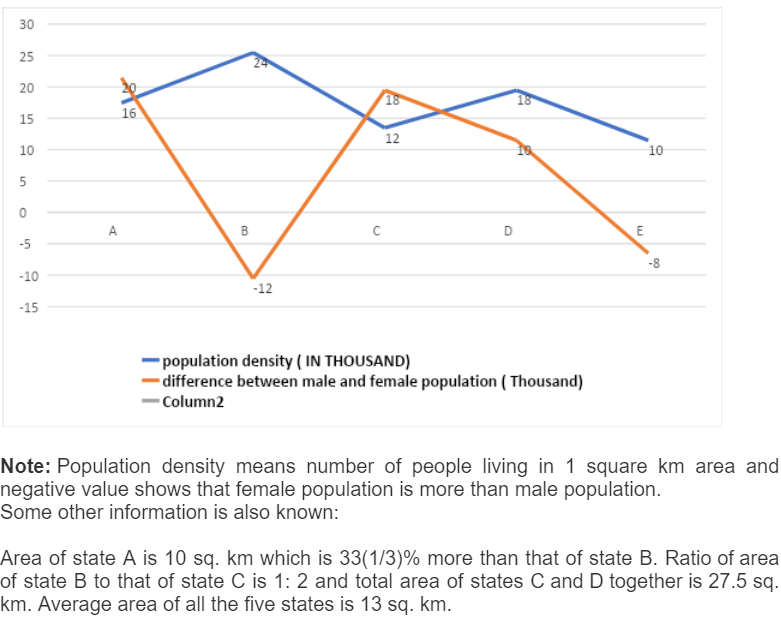 The area of state A is 10 sq. km which is 33(1/3)% more than that of state B. The Ratio of the area of state B to that of state C is 1: 2 and the total area of states C and D together is 27.5 sq. km. Average area of all the five states is 13 sq. km.
{Common Solution}
Area of state A = 10 sq. km
Area of state B = 10 * (3/4) = 7.5 sq. km
Area of state C = 7.5 * (2/1) = 15 sq. km
Area of state D = 27.5 - 15 = 12.5 sq. km
Area of state E = (13 * 5) - (10 + 7.5 + 15 + 12.5) = 20 sq. km
State A:
Total population = 16000 * 10 = 160000
Male population = (160000 + 20000)/2 = 90000
Female population = (160000 - 20000)/2 = 70000. Similarly, we can calculate for other states as well:
The area of state A is 10 sq. km which is 33(1/3)% more than that of state B. The Ratio of the area of state B to that of state C is 1: 2 and the total area of states C and D together is 27.5 sq. km. Average area of all the five states is 13 sq. km.
{Common Solution}
Area of state A = 10 sq. km
Area of state B = 10 * (3/4) = 7.5 sq. km
Area of state C = 7.5 * (2/1) = 15 sq. km
Area of state D = 27.5 - 15 = 12.5 sq. km
Area of state E = (13 * 5) - (10 + 7.5 + 15 + 12.5) = 20 sq. km
State A:
Total population = 16000 * 10 = 160000
Male population = (160000 + 20000)/2 = 90000
Female population = (160000 - 20000)/2 = 70000. Similarly, we can calculate for other states as well:
| States | Total population | Male population | Female population |
| A | 160000 | 90000 | 70000 |
| B | 24000 * 7.5 = 180000 | (180000 - 12000)/2 = 84000 | (180000 + 12000)/2 = 96000 |
| C | 12000 * 15 = 180000 | (180000 + 18000)/2 = 99000 | (180000 - 18000)/2 = 81000 |
| D | 18000 * 12.5 = 225000 | (225000 + 10000)/2 = 117500 | (225000 - 10000)/2 = 107500 |
| E | 10000 * 20 = 200000 | (200000 - 8000)/2 = 96000 | (200000 + 8000)/2 = 104000 |
Previous Year Questions Of Line Graph DI Asked In Banking Exams
 Sol.
Answer: B
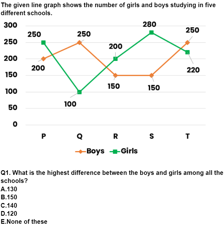
Difference in P = 250 – 200 = 50
Q = 250 – 100 = 150 (Highest difference)
R = 200 – 150 = 50
S = 280 – 150 = 130
T = 250 – 220 = 30
2) What percentage will be the number of girls in school R out of the number of girls in school P and Q together?
A.57.14%
B.68.12%
C.72.34%
D.81.92%
E.92.72%
Sol.
Answer: A
Girls in school R = 200
Girls in P and Q = 250 + 100 = 350
Required % = 200/350 * 100 = 57.14%
3) Find the ratio of the number of boys to girls in the schools P, R and T together.
A.31: 32
B.32: 31
C.60: 67
D.67: 60
E.None of these
Sol.
Answer: C
Boys in the schools P, R and T = 200 + 150 + 250 = 600
Girls in the schools P, R and T = 250 + 200 + 220 = 670
Required ratio = 600: 670 = 60: 67
4) The number of students in school P is how much percentage of the number of students in school S?
A.98.5%
B.104.7%
C.132.8%
D.144.7%
E.158.2%
Sol.
Answer: B
Number of students in P = 200 + 250 = 450
Number of students in S = 150 + 280 = 430
Required % = 450/430 * 100 = 104.7%
5) Which of the schools has the highest number of students (both girls and boys)?
A.P
B.Q
C.R
D.S
E.T
Sol.
Answer: E
Number of students in P = 200 + 250 = 450
Number of students in Q = 100 + 250 = 350
Number of students in R = 150 + 200 = 350
Number of students in S = 150 + 280 = 430
Number of students in T = 220 + 250 = 470 (Highest)
Sol.
Answer: B
Difference in P = 250 – 200 = 50
Q = 250 – 100 = 150 (Highest difference)
R = 200 – 150 = 50
S = 280 – 150 = 130
T = 250 – 220 = 30
2) What percentage will be the number of girls in school R out of the number of girls in school P and Q together?
A.57.14%
B.68.12%
C.72.34%
D.81.92%
E.92.72%
Sol.
Answer: A
Girls in school R = 200
Girls in P and Q = 250 + 100 = 350
Required % = 200/350 * 100 = 57.14%
3) Find the ratio of the number of boys to girls in the schools P, R and T together.
A.31: 32
B.32: 31
C.60: 67
D.67: 60
E.None of these
Sol.
Answer: C
Boys in the schools P, R and T = 200 + 150 + 250 = 600
Girls in the schools P, R and T = 250 + 200 + 220 = 670
Required ratio = 600: 670 = 60: 67
4) The number of students in school P is how much percentage of the number of students in school S?
A.98.5%
B.104.7%
C.132.8%
D.144.7%
E.158.2%
Sol.
Answer: B
Number of students in P = 200 + 250 = 450
Number of students in S = 150 + 280 = 430
Required % = 450/430 * 100 = 104.7%
5) Which of the schools has the highest number of students (both girls and boys)?
A.P
B.Q
C.R
D.S
E.T
Sol.
Answer: E
Number of students in P = 200 + 250 = 450
Number of students in Q = 100 + 250 = 350
Number of students in R = 150 + 200 = 350
Number of students in S = 150 + 280 = 430
Number of students in T = 220 + 250 = 470 (Highest)
| Related Links | |
|---|---|
| Quadratic Equations | Number System |
| Vedic Maths | Pie Chart DI |
| Time and Work | Problem on Ages |
| Flow Chart DI | |
| Arithmetic DI | Permutation and Combination |
Line Graph Data Interpretation FAQs
Q1. Where do we use a line graph in real-life?
Ans. Line graphs are used to track changes over short and long periods. Line graphs are useful to study or represent temperature, rainfall, the revenue of a company, etc.
Q2. What are the Parts of a Line Graph?
Ans. The parts of a line graph include Title, Labels, Scales, Points, and, Lines
Q3. What is a line chart?
Ans. A line chart, also known as a line graph, is a type of chart that displays data points connected by straight line segments. It is particularly useful for showing trends and changes over time or other continuous intervals.
Q4. How do you interpret a line chart?
Ans. To interpret a line chart: X-axis: Represents the independent variable (e.g., time, categories). Y-axis: Represents the dependent variable (e.g., values, quantities). Data points: Represent specific values at different intervals. Lines: Connect data points to show trends or changes over the interval.
Q5. Can line charts display multiple data series?
Ans. Yes, line charts can display multiple data series by plotting multiple lines on the same chart. Each line represents a different data series, allowing for easy comparison of trends between different variables or categories.
Q6. What are some common mistakes to avoid when using line charts?
Ans. Common mistakes include: Misinterpreting the Scale: Ensure the axes are properly scaled to accurately reflect the data. Overcrowding: Avoid overcrowding the chart with too many lines or data points, which can make it confusing to interpret. Ignoring Trends: Always analyze the trend and direction of the lines to derive meaningful insights.
Q7. How can you enhance the effectiveness of a line chart?
Ans. To enhance the effectiveness of a line chart: Use Colors: Use different colors for lines and markers to differentiate data series. Add Annotations: Label important data points or trends directly on the chart. Provide Context: Include a title, axis labels, and a legend (if multiple series) to provide context and clarity.
Q8. What are some real-world applications of line charts?
Ans. Line charts are used in various fields such as finance (for stock price trends), sales (for tracking revenue over time), weather (for temperature trends), and scientific research (for data analysis and trend visualization).


Talk to a counsellorHave doubts? Our support team will be happy to assist you!

Check out these Related Articles


Join 15 Million students on the app today!

Free Learning Resources
PW Books
Notes (Class 10-12)
PW Study Materials
Notes (Class 6-9)
Ncert Solutions
Govt Exams
Our Other Websites
Class 6th to 12th Online Courses
Govt Job Exams Courses
UPSC Coaching
Defence Exam Coaching
Gate Exam Coaching
Other Exams
Know about Physics Wallah
Physics Wallah is an Indian edtech platform that provides accessible & comprehensive learning experiences to students from Class 6th to postgraduate level. We also provide extensive NCERT solutions, sample paper, NEET, JEE Mains, BITSAT previous year papers & more such resources to students. Physics Wallah also caters to over 3.5 million registered students and over 78 lakh+ Youtube subscribers with 4.8 rating on its app.
We Stand Out because
We provide students with intensive courses with India’s qualified & experienced faculties & mentors. PW strives to make the learning experience comprehensive and accessible for students of all sections of society. We believe in empowering every single student who couldn't dream of a good career in engineering and medical field earlier.
Our Key Focus Areas
Physics Wallah's main focus is to make the learning experience as economical as possible for all students. With our affordable courses like Lakshya, Udaan and Arjuna and many others, we have been able to provide a platform for lakhs of aspirants. From providing Chemistry, Maths, Physics formula to giving e-books of eminent authors like RD Sharma, RS Aggarwal and Lakhmir Singh, PW focuses on every single student's need for preparation.
What Makes Us Different
Physics Wallah strives to develop a comprehensive pedagogical structure for students, where they get a state-of-the-art learning experience with study material and resources. Apart from catering students preparing for JEE Mains and NEET, PW also provides study material for each state board like Uttar Pradesh, Bihar, and others
Copyright © 2026 Physicswallah Limited All rights reserved.