

Data Handling Class 8 Maths Formula

Data Handling Class 8 Maths Formula holds significant importance within statistics, encompassing tasks such as data collection, ensuring data security, and the maintenance of research data integrity. It involves working with sets of numbers that facilitate the analysis of specific data sets. Visual representation is a fundamental aspect of data handling, often manifested through various types of graphs. Delving into this intriguing concept, we explore diverse graph forms and engage in solving illustrative examples to enhance comprehension.
Definition of Data Handling
Data Handling involves the systematic gathering, recording, and presentation of information in a manner that facilitates analysis, predictions, and decision-making. Essentially, any elements that can be grouped according to specific comparable attributes can be considered as data. These attributes are the context in which the objects are compared. The representation of data handling typically takes the form of diverse graphical formats such as pictographs, bar graphs, pie charts, histograms, line graphs, and stem and leaf plots, among others. Each of these graphical forms serves a distinct purpose.
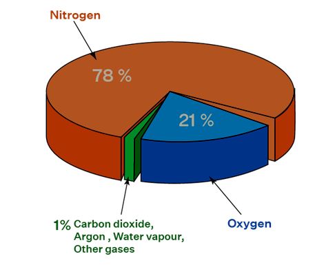
For instance, consider the illustration of the composition of air, which we have encountered in our science lessons. The components of air are depicted using different colors, resembling parts of a pie. This visualization effectively conveys information that would not be as comprehensible through a bar chart, line graph, or any other graphical representation. By closely studying each of these graphical methods, you can grasp their individual purposes and employ them suitably for various scenarios.
Also Check - Rational Number Formula
Types of Data
Data handling strategies vary according to the types of data being dealt with. Data is categorized into two fundamental types: Quantitative Data and Qualitative Data. Quantitative data entails numerical information, while qualitative data provides descriptive insights. Quantitative data is further sub-divides into discrete and continuous data.
Also Check - Quadrilaterals Formula
Important Terms in Data Handling
Within the realm of data handling, there exist four pivotal terms that play a significant role in enhancing the comprehension of the concept. These terms are as follows:
Data: This encompasses a compilation of numerical values, constituting various forms of information.
Download PDF Data Handling Class 8 Maths Formula
Raw Data: The initial observations gathered form what is referred to as raw data, representing the fundamental building blocks of information.
Range: This denotes the distinction between the highest and lowest values within the assortment of data, encapsulating the span of values.
Statistics: The domain of statistics revolves around the tasks of assembling, illustrating, scrutinizing, and interpreting numerical data, facilitating the extraction of meaningful insights
Also Check - Linear Equation Formula
Steps Involved in Data Handling
| Steps | Details |
| Purpose | The issue or objective is recognized and precisely defined. |
| Collection of Data | Data pertinent to the intended objective is gathered. |
| Presentation of Data | The amassed data needs to be displayed in a manner that is both comprehensible and meaningful. This presentation might take the shape of a straightforward table or through means such as tally marks. |
| Graphical Representation of Data | Visual representation enhances the speed of analysis and comprehension of trends, yielding a more substantial influence. |
| Analyzing the Data | Visual depiction amplifies the pace of analysis and grasping trends, resulting in a more pronounced impact.. |
| Conclusion/Inference | Here we provide a solution to our problem statement based on the analysis of the data. |
Graphical Representation of Data Handling
Data manipulation can be portrayed through diverse graphical methods. The following list encompasses various types of graphical representations that are highly efficient in facilitating data handling.
Bar Graphs
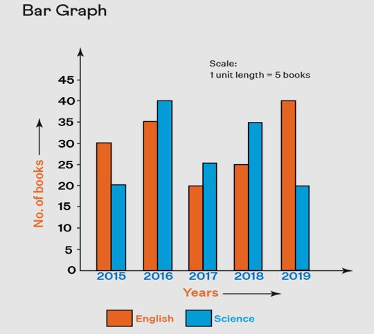
Bar graphs visually depict data using vertical or horizontal bars, wherein the lengths of these bars are proportional to the corresponding values they represent. This graphical format proves invaluable in facilitating data comparison, making it one of the most extensively utilized types of graphs in the realm of statistics. Refer to the image below for an illustrative example of a bar graph within the context of data handling.
Pictographs or Picture Graphs
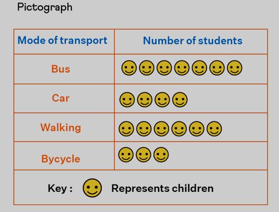
A pictograph is a graphical representation wherein data is conveyed through the utilization of pictures, icons, or symbols. It constitutes the most elementary method of illustrating data within the realms of statistics and data management. Given the prevalence of images and symbols in a pictograph, data interpretation becomes notably straightforward, further facilitating the depiction of substantial volumes of data. The example provided below offers enhanced clarity in comprehending this concept.
Line Graphs
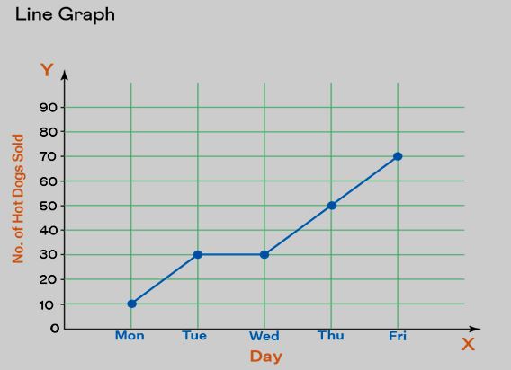
In the realm of data manipulation, when information is depicted using a visual representation resembling a line on a graph, it is referred to as a line graph. This graphical tool is valuable for illustrating various shifts or fluctuations within the data. The line that appears on the graph is formed by connecting individual data points, thereby creating line segments. To gain a clearer comprehension, refer to the provided example.
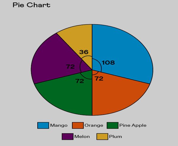
Pie Charts
A pie chart entails data visualized within a circular graph partitioned into smaller segments, each signifying specific information. Such charts are useful for displaying business financials like profits and losses, as well as educational data like quantities. This graphical representation is extensively employed in the realms of marketing and sales. For instance, consider the example provided below, where a pie chart illustrates preferences for various fruits among a total of 360 individuals.
Scatter Plot
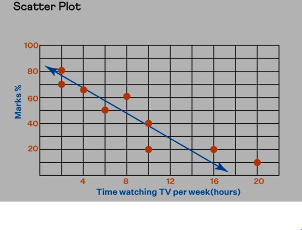
A scatter plot portrays individual data points, often accompanied by a best-fit line drawn through a subset of these points. This type of graph is capable of depicting three-dimensional data in the context of data analysis. To enhance your comprehension, refer to the provided example below.
Data Handling Class 8 Maths Formula FAQs
Define the term Data handling.
What categorizations exist within the realm of data handling?
What does the process of data handling entail in terms of its sequential actions?
How does a chart differ from a graph?