IELTS Sample Charts for Writing Task 1 (Bar Graph, Table, Pie Chart)

IELTS Sample Charts for Writing Task 1 : Students have to write a report of at least 150 words for the writing task on the IELTS in answer to a given graph (bar, line, or pie graph), table, chart, or process. An examiner tests your writing task performance by asking you to recognize and summarize the key aspects of the provided graph.
It is required to identify the key aspects and patterns in factual information to characterize and compare the data. IELTS writing skills are necessary before starting a task, no matter your level of English proficiency. This article will provide you with IELTS Sample Charts for Writing Task 1, and types of IELTS Sample Charts, instructions for IELTS Sample Charts for Writing Task 1.IELTS Sample Charts for Writing Task 1
In IELTS Academic Writing Task 1, you are presented with a visual representation of data and asked to write a descriptive report of at least 150 words. You are expected to:
-
Describe the main features
-
Identify significant trends or comparisons
-
Avoid personal opinions or explanations
You should complete Task 1 in approximately 20 minutes, as Task 2 carries more weight in scoring.
Types of IELTS Sample Charts for Writing Task 1
Here are some IELTS sample charts to help you practice writing task 1. You will receive one of the following for the IELTS writing task 1 (academic paper), and you will have 20 minutes to write the report:1. Bar Graphs
Bar charts use rectangular bars to represent quantities. They are useful for comparing:
-
Different groups or categories
-
Changes over time
-
Male vs. female data
-
Country-based comparisons
Example:
A bar graph showing the number of students enrolled in five different university courses in 2020.
2. Line Graphs
Line graphs display changes or trends over a period of time. They typically show:
-
Increases or decreases
-
Sharp rises or gradual declines
-
Comparisons between multiple lines
Example:
A line graph showing the unemployment rate in three countries from 2000 to 2020.
3. Pie Charts
Pie charts represent parts of a whole. Each sector is a percentage of the total.
Key uses:
-
Show proportion
-
Compare share sizes
-
Highlight dominant categories
Example:
Two pie charts showing the sources of energy production in 1990 and 2020.
4. Tables
Tables display data in rows and columns. They may include words, numbers, or a combination.
Table tasks require you to:
-
Summarise numerical data
-
Compare categories
-
Identify high or low values
Example:
A table showing the population, GDP, and literacy rate of five countries in a given year.
5. Process Diagrams
These show a step-by-step flow of a linear or cyclical process. They test your ability to describe actions, sequence, and relationships.
Example:
A process diagram showing how glass bottles are recycled.
6. Maps
Maps compare changes in geographical locations over time. Tasks often involve:
-
Describing changes to land use
-
Highlighting construction, removal, or development
-
Comparing layouts
Example:
Two maps showing a coastal town in 1990 and 2020.
7. Mixed or Combination Charts
Sometimes, you’ll get two different types of visuals in one task, such as:
-
Bar chart + pie chart
-
Line graph + table
-
Map + process diagram
Example:
A bar graph showing car sales in four countries and a pie chart showing the market share of each country.
IELTS Sample Charts for Writing Task 1 Instruction
Here are some instructions for IELTS Sample Charts for Writing Task 1 given below:- You have to write 150 words or more.
- Writing less than 150 words will not meet the marking criteria, so you are unlikely to receive a grade higher than a Band 5 for "task achievement."
- You will have around 20 minutes to organize and write your report.
- You have to write formally.
- Task 1 makes up half of the total points that Task 2 makes up. Task 1 makes up 33% of the Writing exam's final score.
Types of IELTS Sample Charts for Writing Task 1
In this article, types of IELTS Sample Charts for Writing Task 1 are given below:Bar charts
Writing Task 1 of the IELTS exam often includes questions with bar charts or bar graphs. They consist of rectangular bars, which can be set horizontally or vertically, with lengths equal to the data values they represent. Comparing two or more data is the usual use case for bar graphs.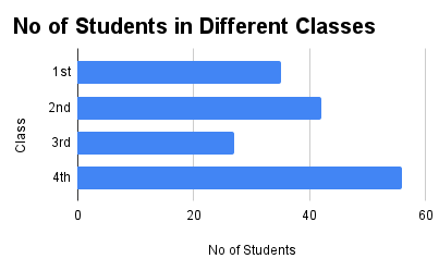
Line graph
One or more lines that show how an object has changed over time make up a line graph. Each object has a matching line that represents it. Line graphs in IELTS Writing Task 1 always display changes over time, compared to other charts format.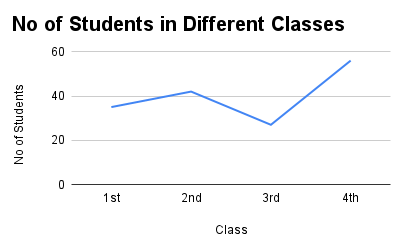
Table
You have to provide an overview of some visual information for Academic Writing Task 1. There may be a table with this visual data. Tables comprise words, numbers or signs, or a mix of these, arranged in columns or boxes to show a set of facts and the relationship between them.
Pie chart
A circular graph with sectors is called a pie chart. Each sector represents a part of the overall total, commonly expressed as a percentage. Two pie charts from the same year or separate years may be provided for IELTS writing task 1.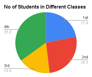
| IELTS Pie Chart Task 1 | Cohesive Devices in IELTS Writing |
Diagram or process
Cyclical processes, such as the life cycle of a pond frog from egg to adult, can be depicted in process diagrams. Take note of how the steps in the diagrams are usually represented by arrows. This diagram takes you through the whole process, from start to end. This process is linear.Map
Maps are provided in the IELTS because they ask you to show changes throughout time as well as the actual structure of a place. You will be given two identical maps and asked to describe the differences between them.Combination of the above (multiple tasks)
Questions that combine two different kinds of graphs are known as combination questions. The academic writing task 1 on the IELTS has two different kinds of combinations. Similar combinations You can see that similar types of charts may be provided. For example,- Bar chart + bar chart
- Pie chart + pie chart
- Table + table
- Life cycle + life cycle
- Line graph + line graph
- Map + map
- Bar chart + pie chart
- Bar chart + line graph
- Bar chart + tabled
- Pie chart + line graph
- Pie chart + table
- Life cycle + flowchart
Vocabulary for Describing Charts
Use appropriate vocabulary to describe trends, changes, and comparisons:
|
Vocabulary for Describing Charts |
|
|---|---|
|
Category |
Vocabulary/Examples |
|
Verbs (Increase) |
increase, rise, climb, grow |
|
Verbs (Decrease) |
decrease, drop, fall, decline |
|
Verbs (Stability) |
fluctuate, remain stable, plateau, peak |
|
Adverbs |
gradually, steadily, slightly, significantly, sharply |
|
Adjectives |
high, low, major, minor, slight, dramatic |
|
Phrases |
“There was a significant rise in…” “The percentage dropped slightly to…” “It remained unchanged over the period…” “X was the highest, whereas Y was the lowest…” |
Guidance of PW IELTS
Physics Wallah offers multiple online IELTS courses for all students. Follow the IELTS pages to better prepare for the exam.
| What is IELTS Exam? | Documents Required for IELTS Registration |
| IELTS exam eligibility requirements | IELTS Exam Fees |
| IELTS test results | IELTS Exam Pattern |
IELTS Sample Charts for Writing Task 1 FAQs
Q1- How many charts are in writing task 1?
Q2- How do you compare data in writing Task 1?
Q3- Which tense is used in writing task 1 process?
Q4- How to summarize a line graph?
Q5- What is the rule of writing task 1?
Q6- What is a line chart in IELTS?
Q7- How many bands for writing task 1?
Q8- What is the format of writing task 1 in IELTS?