IELTS Line Graph Vocabulary, Tips to Use Line Graph Vocabulary
IELTS Line Graph Vocabulary: The International English Language Testing System (IELTS) evaluates English proficiency through a variety of tasks. The Writing section consists of Task 1 and Task 2. IELTS Writing Task 1 requires the description of visual data, such as line graphs. In the IELTS Line Graph task, it is important to describe trends, comparisons and changes over time.
Effective use of IELTS Line Graph vocabulary is essential. Verbs such as "rise," "fall," "increase," "decrease," "fluctuate," and "remain stable" effectively illustrate trends. Additionally, adjectives and adverbs like "sharply," "dramatically," "slightly," and "significantly" provide further detail. Time phrases such as "over the period," "during the years," and "by the end of" offer context, while comparative phrases like "compared to," "in comparison with," "whereas," and "while" emphasize differences.
Mastering this specific IELTS Line Graph vocabulary is essential for demonstrating language proficiency, which is vital for achieving high scores in IELTS Writing Task 1. The article below provides a detailed overview of the IELTS Line Graph vocabulary and the requirements of the IELTS Line Graph task.
Mastering IELTS Writing Task 1 Line Graph Model for Band 9
What is the IELTS Line Graph Task?
IELTS Line Graph Task is part of the IELTS Writing Module, focusing on analyzing and describing a line graph that presents data over time. This task requires you to identify trends, patterns, and significant changes, articulating your observations clearly and concisely.
In this task, you will summarize visual information, showcasing your ability to report on data trends, such as population growth or economic shifts. It is essential to emphasize key features and comparisons while using varied vocabulary.
| Essential IELTS Vocabulary Related Pages | |
|---|---|
| IELTS Work Vocabulary | IELTS Map Vocabulary |
| IELTS Family Vocabulary | IELTS Sports Vocabulary |
IELTS Line Graph Vocabulary
When describing line graphs in the IELTS exam , it's important to use precise vocabulary that accurately conveys trends. Below is a categorized list of verbs, nouns, adverbs, adjectives, and time expressions that can enhance your writing. Each category is followed by an example question and answer.
Verbs
- Increase : To grow in amount or degree over time. This term describes upward trends in data.
- Decrease : To diminish in amount or degree, highlighting downward trends.
- Fluctuate : To rise and fall irregularly, often reflecting instability in data.
- Stabilize : To become steady, indicating no significant changes over time.
- Peak : To reach the highest point, often marking a turning point in the trend.
- Drop : To fall suddenly or sharply, indicating a quick decline.
- Surge : A sudden and powerful increase, often used for sharp rises.
Example Question : Describe a line graph showing the number of cars sold from 2010 to 2020. Example Answer : The graph illustrates that car sales increased steadily from 2010 until 2015, before peaking in 2016.
Nouns
- Trend : A general direction of change observed in data over time.
- Fluctuation : Variations that occur in a dataset, often irregular.
- Peak : The highest point reached during a specific timeframe.
- Decline : A gradual reduction in numbers or quality.
- Stability : The condition of being stable over a duration.
- Recovery : A return to a previous level after a decline.
- Proportion : A part or share of a whole, often used in comparative analysis.
Example Question : What does the line graph depict about population growth? Example Answer : The line graph shows a significant trend in population growth from 2000 to 2020, with notable fluctuations between 2015 and 2018.
| IELTS Pie Chart Task 1 | Cohesive Devices in IELTS Writing |
Adverbs
- Rapidly : Indicates a fast change over a short period.
- Gradually : Refers to slow changes that occur over time.
- Significantly : A notable degree of change, often emphasizing importance.
- Slightly : Indicates a minor or small degree of change.
- Dramatically : Refers to a striking or sudden change in data.
- Consistently : Describes a regular and uniform pattern of change.
- Irregularly : Indicates changes that do not follow a consistent pattern.
Example Question : How did internet usage change over the years? Example Answer : Internet usage has increased dramatically since 2010, with a gradual rise in the years prior.
Adjectives
- Steady : Describes a consistent rate of change without significant fluctuations.
- Variable : Indicates inconsistency in data, often highlighting unpredictability.
- Consistent : Reflects uniformity in trends over time.
- Intermittent : Describes irregular occurrences that are not continuous.
- Marginal : Indicates minor changes that are often not substantial.
- Substantial : Refers to significant or considerable changes.
- Unstable : Describes fluctuations that lack a steady pattern.
Example Question : Analyze the graph showing temperature changes. Example Answer : The temperature changes exhibited a steady rise during summer months, while winter showed more variable fluctuations.
Also Check:
Time Expressions
- Over the years : A general timeframe indicating a long duration.
- From...to... : Specifies a particular period of time in detail.
- During the period : Refers to a defined timeframe in the analysis.
- In the following years : Indicates years after a specified date for trends.
- By the end of : Marks a conclusion or significant point in a time frame.
- In the early stages : Refers to the initial phase of a trend or period.
- Subsequently : Indicates a following event or time period.
Example Question : Explain the sales trends over a decade. Example Answer : From 2010 to 2020 , sales increased steadily, with a notable surge during the period of 2015 to 2017.
Comparison Vocabulary for the Introduction Part
- Compared to : Highlights relationships between two datasets or entities.
- In contrast : Emphasizes differences between two or more trends.
- Similar to : Indicates likeness between two trends or datasets.
- Unlike : Shows distinct differences in trends.
- As opposed to : Compares different entities, often contrasting two situations.
- Relative to : Indicates a relationship or comparison between data points.
- While : Often used to highlight simultaneous contrasting trends.
Example Question : What can you say about the sales of two different products? Example Answer : The line graph shows the sales of Product A compared to Product B, which experienced a steady increase in contrast to Product A’s fluctuating sales.
Vocabulary to Start the Report Body
- The graph illustrates : Introduces what the graph depicts clearly.
- It is clear that : Indicates obvious findings based on data.
- The data reveals : Presents key insights drawn from the graph.
- According to the graph : References the data is visually represented.
- From the data, it can be seen that it introduces observations and conclusions.
- This graph depicts : Directly states what the graph is showing.
- Overall, the trends suggest : Introduces a summary or generalization about the data.
Example Question : How would you start describing the graph? Example Answer : The graph illustrates the changes in consumer preferences over a ten-year period.
Vocabulary to Show Trend Changes
- Rose sharply : Indicates a sudden and significant increase.
- Declined gradually : Suggests a slow and steady decrease.
- Remained stable : No significant change was observed over time.
- Saw a rise : Indicates an experience of growth or increase.
- Dropped significantly : Suggests a large and impactful decrease.
- Plateaued : Indicates a period of little to no change after a rise.
- Rebounded : Refers to a return to a higher level after a decline.
Example Question : How would you describe the trend of employment rates? Example Answer : Employment rates rose sharply from 2010 to 2015 before declining gradually in the following years.
Vocabulary Words/Phrases of Approximation
- Approximately : Indicates an estimate or near value without exactness.
- Roughly : Similar to approximately, conveying a general estimate.
- About : A term used for a general estimation of figures.
- In the region of : Refers to an approximate range or value.
- Close to : Nearly equal to a specific numerical value.
- Around : A casual term indicating a close estimation.
- In the vicinity of : Suggests a rough estimate around a specific figure.
Example Question : Can you approximate the number of visitors? Example Answer : The graph indicates that the number of visitors was approximately 200,000 in 2019, with numbers in the region of 250,000 expected in 2020.
This detailed breakdown of IELTS line graph vocabulary, along with examples, should be very useful for improving your writing skills for the exam!
| IELTS Writing Related Links | |
|---|---|
| IELTS Writing Band Score | IELTS Writing Band Descriptors |
| IELTS Writing Test Format | IELTS Writing Task 1 |
IELTS Line Graph Task Sample Question and Answer
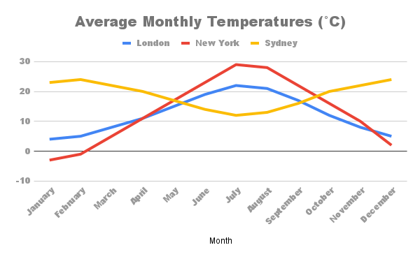
Question: The graph below shows the average monthly temperatures in three cities: London, New York, and Sydney.
Summarize the information by selecting and reporting the main features, and make comparisons where relevant.
Sample Answer
The line graph illustrates the average monthly temperatures in London, New York, and Sydney throughout the year. Overall, it is evident that each city exhibits distinct temperature patterns, with London and New York experiencing more variation than Sydney.
In London, temperatures are relatively mild, ranging from about 4°C in January to a peak of around 22°C in July. The temperature then gradually decreases to approximately 5°C by December. This creates a clear seasonal trend, with a noticeable increase in temperature during the summer months.
New York, on the other hand, shows a more extreme temperature range. The average temperature starts at about -3°C in January, reaches its highest point of around 29°C in July, and then falls back to about 1°C by December. This illustrates the significant seasonal variation typical of this city, with very cold winters and hot summers.
Sydney presents a contrasting pattern, with temperatures remaining consistently warm throughout the year. The lowest average temperature is around 8°C in July, while the highest reaches approximately 26°C in January. Unlike London and New York, Sydney's temperature does not experience drastic changes, which is characteristic of its subtropical climate.
In summary, while London and New York show marked seasonal fluctuations with distinct winter and summer months, Sydney maintains a more stable and warm climate year-round. This highlights the diverse climatic conditions across the three cities.
Tips to Use IELTS Line Graph Vocabulary
To effectively describe line graphs in the IELTS writing task, utilizing appropriate vocabulary is essential. These tips can enhance clarity and coherence, allowing for a more precise analysis of the data presented. Below are key strategies for using line graph vocabulary effectively.
- Use Descriptive Verbs : Verbs like "illustrate," "represent," and "demonstrate" clarify the graph’s meaning and highlight key trends, making your analysis more engaging.
- Employ Comparative Language : Phrases such as "higher than" or "lower than" facilitate clear comparisons, while "in contrast" and "similarly" emphasize differences or similarities.
- Use Adjectives for Clarity : Adjectives like "average," "significant," and "consistent" specify values, highlight changes, and indicate stable trends, enhancing reader understanding.
- Incorporate Time References : Phrases like "throughout the year," "by December," and "during the summer months" provide context, helping the reader follow the trends over time.
- Highlight Trends : Words like "increase," "decrease," and "peak" clearly describe data movements, allowing you to indicate key points in your analysis.
- Summarize Data : Use phrases like "in summary," "overall," and "the main features are" to effectively conclude your analysis and synthesize the information.
- Use Transitional Phrases : Phrases like "on the other hand," "for example," and "this illustrates that" create logical flow, connecting points and supporting your arguments with evidence.
By implementing these strategies, you can effectively convey information and comparisons in your IELTS writing tasks. Mastering this vocabulary not only improves clarity but also helps you achieve a higher score by demonstrating your ability to analyze and interpret data accurately.
IELTS Line Graph Vocabulary FAQs
What verbs should I use to describe upward trends in IELTS line graphs?
How can I describe a sudden decrease in data for IELTS Task 1?
What are some effective adverbs and adjectives in IELTS line graphs?
How do I compare data points effectively in IELTS line graph descriptions?