

How to Write a Line Graph for IELTS Writing Task 1? Sample Answer
How to Write a Line Graph for IELTS Writing Task 1: The International English Language Testing System (IELTS) is a test used to measure the English skills of people who are not native speakers. In the Writing section, Task 1 asks candidates to explain visual information like graphs, charts, or tables. A line graph, in particular, shows data points linked by lines to illustrate changes over time.
To achieve a higher score, candidates must correctly describe these trends, compare information, and point out important details. This article explains how to write a line graph for IELTS Writing Task 1 , offering tips on how to structure your response, choose the right words, and include key data. It also includes a sample answer to help you understand how to complete this task and improve your IELTS Writing score.
What is Line Graph for IELTS Writing Task 1?
A line graph in IELTS Writing Task 1 is a visual display of data points linked by straight lines, usually showing trends over a certain period. This type of graph is often used to present changes in values, like population growth, temperature changes, or sales figures, over time.
In IELTS Writing Task 1, you need to analyze and describe the information in the line graph. This means summarizing key trends, making comparisons, and highlighting important data points. To do well, you should use the right vocabulary, follow a clear structure, and interpret the data accurately. Being able to describe a line graph effectively is important for achieving a higher score in this task.
How to Write a Line Graph for IELTS Writing Task 1?
When writing about a line graph in IELTS Writing Task 1, it is important to clearly describe the information presented, highlighting the main trends, comparing data, and using appropriate language. Follow these steps to structure your answer effectively.
- Introduction: Start by briefly introducing the graph. Paraphrase the provided information and mention the type of graph and the time period it covers.
- Overview: Give a general overview of the key trends or patterns in the graph. Focus on any significant increases, decreases, or noticeable changes.
- Detailed Description: Break down the data into logical sections. Describe each section with specific data points, noting any changes or fluctuations over time.
- Comparisons: Make comparisons between different trends in the graph. Use comparative words to highlight differences and similarities between the data.
- Conclusion: End with a summary of the key trends and information you have described, without introducing any new details.
| IELTS Writing Related Links | |
|---|---|
| IELTS Writing Band Score | IELTS Writing Band Descriptors |
| IELTS Writing Test Format | IELTS Writing Task 1 |
How to Write a Line Graph for IELTS Writing Task 1- Sample Answer
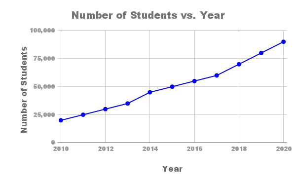
The line graph below shows the number of international students enrolled in a university from 2010 to 2020. Summarize the information by selecting and reporting the main features, and make comparisons where relevant.
Sample Answer
The line graph illustrates the number of international students enrolled in a university from 2010 to 2020.
Overall, there was a significant increase in the number of international students over the period. The enrollment began at 20,000 in 2010 and gradually increased to 90,000 by 2020, showing a consistent upward trend.
From 2010 to 2013, the number of students rose steadily from 20,000 to 35,000. The growth rate accelerated between 2013 and 2015, with the enrollment reaching 50,000. This period marked the highest rate of increase compared to previous years.
Between 2015 and 2017, the number of students continued to grow, albeit at a slightly slower pace, reaching 60,000. The pace picked up again from 2017 to 2018, with enrollment rising sharply to 70,000. The upward trend persisted, with the number of students reaching 80,000 in 2019 and peaking at 90,000 in 2020.
In summary, the university experienced a substantial increase in the enrollment of international students, with the number quadrupling over the ten-year period from 2010 to 2020.
By practicing this type of question and analyzing the provided sample answer, you can effectively write a line graph description for IELTS Writing Task 1 and aim for a higher score.
Also Check:
Tips to Write Line Graph for IELTS Writing Task 1- Score Band 9
To write an effective line graph description in IELTS Writing Task 1, follow these steps for a well-structured response. It is important to paraphrase the question, organize your data, and use appropriate vocabulary to show your skills.
- Paraphrase the Question: Start your response by rephrasing the given question to show your understanding and range of vocabulary.
- Overview of Main Trends: Give a brief summary of the major trends or key changes shown in the graph without mentioning specific data.
- Divide Data into Logical Segments: Organize the data into clear sections to ensure your answer is coherent and easy to follow.
- Use a Variety of Vocabulary: Use different words like "increase," "decline," or "fluctuate" to describe the trends and avoid repetition.
- Include Specific Data: Mention exact data points, such as years and figures, to support your analysis and make it more accurate.
- Compare and Contrast: Highlight the differences and similarities between the data points or periods by making comparisons.
- Maintain Proper Grammar and Syntax: Ensure your sentences are grammatically correct and vary in structure to show a range of grammar skills.
- Use Linking Words: Include linking words like "however," "in contrast," or "overall" to smoothly connect your ideas and improve the flow of your writing.
Following these tips will help you write a clear and effective line graph description for IELTS Writing Task 1. Regular practice will improve your skills and help you score higher.
Increase your IELTS band score with PW's IELTS preparation course. Receive expert help, complete study materials, and customized practice tests. Enroll today to reach your desired band score!
How to Write a Line Graph for IELTS Writing Task 1 FAQs
How to do a line graph in writing task 1?
How to start writing a graph in IELTS?
What type of graph is asked in IELTS task 1?
Which tense is used in writing task 1 line graph?
How to get a high score in IELTS writing task 1?