Group data mean
Statistics of Class 8
UNGROUPED FREQUENCY DISTRIBUTION TABLE:
When number of observations in an experiment is large then to make the data more easily understandable, we write it in a table which is called ungrouped frequency distribution.
For e.g. Marks obtained by 20 students is 10, 20, 36, 92, 95, 40, 50, 56, 60, 70, 92, 88, 80, 70, 72, 70, 36, 40, 36, 40.
Table is :
|
|
Marks |
No. of Students |
|
10 |
1 |
|
|
20 |
1 |
|
|
36 |
3 |
|
|
40 |
3 |
|
|
50 |
1 |
|
|
56 |
1 |
|
|
60 |
1 |
|
|
70 |
3 |
|
|
72 |
1 |
|
|
80 |
1 |
|
|
88 |
1 |
|
|
92 |
2 |
|
|
95 |
1 |
|
|
20 |
GROUPED FREQUENCY DISTRIBUTION TABLE:
Discrete grouped frequency distribution:
We can also write above example in discrete grouped frequency distribution as.
|
Class |
Frequency |
Tally marks |
|
10 – 19 |
1 |
I |
|
20 – 29 |
1 |
I |
|
30 – 39 |
3 |
III |
|
40 – 49 |
3 |
III |
|
50 – 59 |
2 |
II |
|
60 – 69 |
1 |
I |
|
70 – 79 |
4 |
IIII |
|
80 – 89 |
2 |
II |
|
90 – 99 |
3 |
III |
|
20 |
Continuous grouped frequency distribution:
We can also write above example as continuous grouped frequency distribution as.
|
Class |
Frequency |
Tally marks |
|
10 – 20 |
1 |
I |
|
20 – 30 |
1 |
I |
|
30 – 40 |
3 |
III |
|
40 – 50 |
3 |
III |
|
50 – 60 |
2 |
II |
|
60 – 70 |
1 |
I |
|
70 – 80 |
4 |
IIII |
|
80 – 90 |
2 |
II |
|
90 – 100 |
3 |
III |
|
20 |
10 – 19, 20 – 29, 30 – 39, …... 90 – 99 are called class-interval or classes.
Size of class is called class-size or class width, which is 10.
Lower number of class interval is called lower class limit while greater number is called upper class limit.
Class mark
Frequency and Frequency Tables:
The frequency of a particular data value is the number of times the data value occurs.
For example, if four students have a score of 80 in mathematics, and then the score of 80 is said to have a frequency of 4. The frequency of a data value is often represented by f.
A frequency table is constructed by arranging collected data values in ascending order of magnitude with their corresponding frequencies.
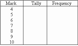
question 1. The marks awarded for an assignment set for a Year 8 class of 20 students were as follows: 6 7 5 7 7 8 7 6 9 7 4 10 6 8 8 9 5 6 4 8
Present this information in a frequency table.
Solution: To construct a frequency table, we proceed as follows:
Step 1:Construct a table with three columns. The first column shows what is being arranged in ascending order (i.e. the marks). The lowest mark is 4. So, start from 4 in the first column as shown below.
Step 2:Go through the list of marks. The first mark in the list is 6, so put a tally mark against 6 in the second column. The second mark in the list is 7, so put a tally mark against 7 in the second column. The third mark in the list is 5, so put a tally mark against 5 in the third column as shown below.
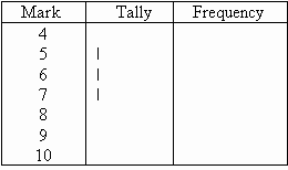
We continue this process until all marks in the list are tallied.
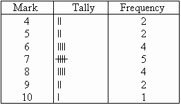
Step 3:Count the number of tally marks for each mark and write it in third column. The finished frequency table is as follows:
In general:
We use the following steps to construct a frequency table:
Step 1:Construct a table with three columns. Then in the first column, write down all of the data values in ascending order of magnitude.
Step 2:To complete the second column, go through the list of data values and place one tally mark at the appropriate place in the second column for every data value. When the fifth tally is reached for a mark, draw a horizontal line through the first four tally marks as shown for 7 in the above frequency table. We continue this process until all data values in the list are tallied.
Step 3:Count the number of tally marks for each data value and write it in the third column.
Class Intervals (or Groups)
When the set of data values are spread out, it is difficult to set up a frequency table for every data value as there will be too many rows in the table. So we group the data into class intervals (or groups) to help us organise, interpret and analyse the data.
Ideally, we should have between five and ten rows in a frequency table. Bear this in mind when deciding the size of the class interval (or group).
Each group starts at a data value that is a multiple of that group. For example, if the size of the group is 5, then the groups should start at 5, 10, 15, 20 etc. Likewise, if the size of the group is 10, then the groups should start at 10, 20, 30, 40 etc.
The frequency of a group (or class interval) is the number of data values that fall in the range specified by that group (or class interval).
GRAPHS:
visual display of data used to present frequency distributions so that the shape of the distribution can easily be seen.
- Bar graph - a form of graph that uses bars separated by an arbitrary amount of space to represent how often elements within a category occur. The higher the bar, the higher the frequency of occurrence. The underlying measurement scale is discrete (nominal or ordinal-scale data), not continuous.
Bar charts are often used to present data in a pictorial form to illustrate the information collected and highlight important points. They are especially useful to depict monthly car production, monthly sales, quarterly profit, average annual rainfall etc. A bar chart provides a useful comparison of data over time. The height of each bar shows the total amount of the item of interest for each month (or year).
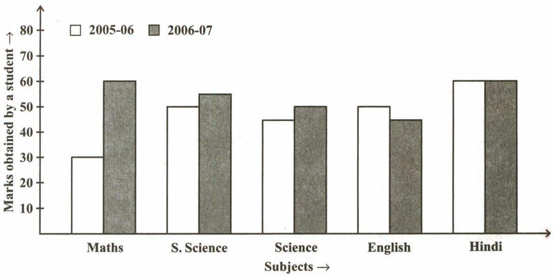
DOUBLE BAR GRAPH:
A bar graph showing two sets of data simultaneously. It is useful for the comparison of the data.
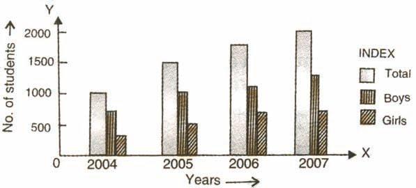
MULTIPLE BAR GRAPH:
Sets of two or more related phenomenon can be represented by multiple bar diagrams. In these diagrams, each phenomenon in a particular set is represented by a separate bar of different shade, colour etc. These diagrams are suitable for comparison of various related phenomenon.
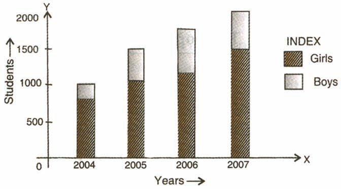
COMPONENT BAR GRAPH:
If a given magnitude can be broken into parts of which it is composed of, then bars are drawn corresponding to different total values of the variables.
HISTOGRAM:
A form of a bar graph used with interval or ratio-scaled data. Unlike the bar graph, bars in a histogram touch with the width of the bars defined by the upper and lower limits of the interval. The measurement scale is continuous, so the lower limit of any one interval is also the upper limit of the previous interval.
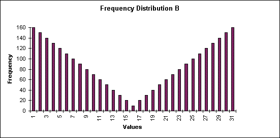
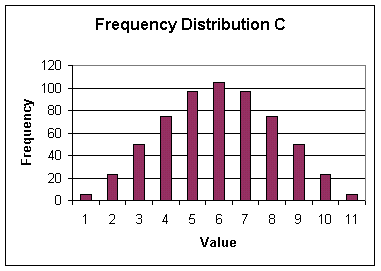
For a continuous frequency distribution, a series of rectangles are constructed having their widths equal to the widths of the classes and heights (or lengths) are selected in such a way that, the areas of the rectangles are respectively proportional to the frequencies of the classes. In case, the widths of the classes are uniformly same, the heights of the rectangles are selected proportional to the corresponding frequencies of the classes. By selecting suitable scales on x-axis and y-axis, the rectangles are drawn leaving no gap in between consecutive rectangles. The figure drawn appears like a single solid figure and it is called a histogram.
PIE-CHARTS:
Pie charts are useful to compare different parts of a whole amount. They are often used to present financial information. E.g. A company's expenditure can be shown to be the sum of its parts including different expense categories such as salaries, borrowing interest, taxation and general running costs (i.e. rent, electricity, heating etc).
A pie chart is a circular chart in which the circle is divided into sectors. Each sector visually represents an item in a data set to match the amount of the item as a percentage or fraction of the total data set.
In a pie chart, the various observations or components are represented by the sectors of a circle and the whole circle represents the sum of the values of all components.
Central angle for a component 
- Construction of a pie chart for a given data
Steps of construction
question 1. Calculate the central angle for each component, given by
central angle of a component 
question 2. Draw a circle of convenient radius.
question 3. Within this circle, draw a horizontal radius.
question 4. Starting with the horizontal radius, draw radii making central angles corresponding to the values of the respective components, till all the components are exhausted. These radii divide the whole circle into various sectors.
question 5. Shade each sector with different design.
This will be the required pie chart for the given data.
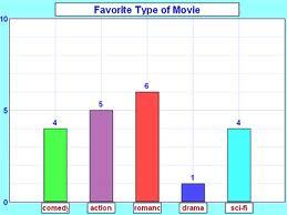
question 1. Which is the most viewed movie category?
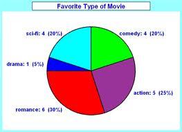
Solution: Movie category – romance- 30%
question 2. Which is the most visited Social Networking website?
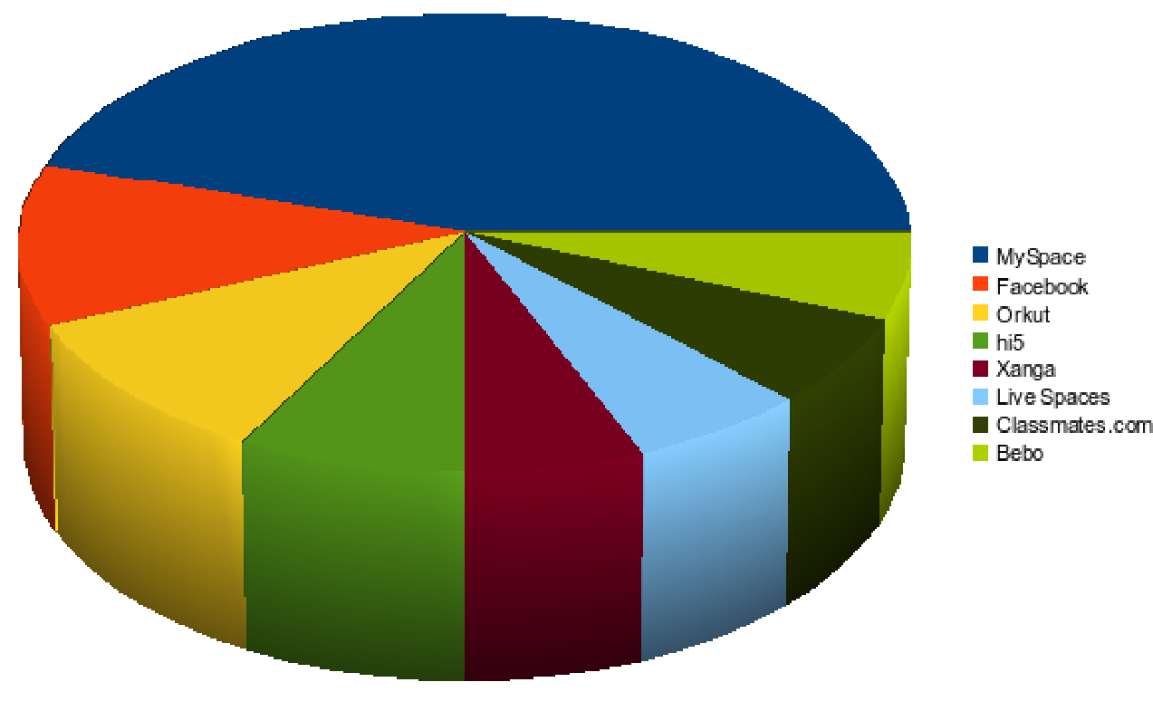
Solution:My space is the most viewed social networking site.
Pie charts are useful to compare different parts of a whole amount. They are often used to present financial information. E.g. A company's expenditure can be shown to be the sum of its parts including different expense categories such as salaries, borrowing interest, taxation and general running costs (i.e. rent, electricity, heating etc).
Related Topics
MEASURES OF CENTER:
Plotting data in a frequency distribution shows the general shape of the distribution and gives a general sense of how the numbers are bunched. Several statistics can be used to represent the "center" of the distribution. These statistics are commonly referred to as measures of central tendency.
MEAN:
One of the most useful and widely used techniques for doing this—one which you already know—is the average, or, as it is know in statistics, the mean. And you know how to calculate the mean: you simply add up a set of scores and divide by the number of scores. Thus we have our first and perhaps the most basic statistical formula:

Where:
 (sometimes call the X-bar) is the symbol for the mean.
∑ (the Greek letter sigma) is the symbol for summation.
X is the symbol for the scores.
N is the symbol for the number of scores.
This is pretty simple when you have only a few numbers. For example, if you have just 6 numbers (3, 9, 10, 8, 6, and 5), you insert them into the formula for the mean, and do the math:

The mean is the balance point in a distribution such that if you subtract each value in the distribution from the mean and sum all of these deviation scores, the result will be zero
MEDIAN:
The median is the point in the distribution above which and below which 50% of the scores lie. In other words, if we list the scores in order from highest to lowest (or lowest to highest) and find the middle-most score, that’s the median.
For example, suppose we have the following scores: 2, 12, 4, 11, 3, 7, 10, 5, 9, 6. The next step is to array them in order from lowest to highest.
2
3
4
5
6
7
9
10
11
12
Since we have 10 scores, and 50% of 10 is 5, we want the point above which and below which there are five scores. Carefull, If you count up from the bottom, you might think the median is 6. But that’s not right because there are 4 scores below 6 and 5 above it. So how do we deal with that problem? We deal with it by understanding that in statistics, a measurement or a score is regarded not as a point but as an interval ranging from half a unit below to half a unit above the value. So in this case, the actual midpoint or median of this distribution—the point above which and below which 50% of the scores lie—is 6.5
In other words, the median is the score that divides the distribution into halves; half of the scores are above the median and half are below it when the data are arranged in numerical order. The median is also referred to as the score at the 50th percentile in the distribution. The median location of N numbers can be found by the formula (N + 1) / 2. When N is an odd number, the formula yields a integer that represents the value in a numerically ordered distribution corresponding to the median location. (For example, in the distribution of numbers (3 1 5 4 9 9 8) the median location is (7 + 1) / 2 = 4. When applied to the ordered distribution (1 3 4 5 8 9 9), the value 5 is the median, three scores are above 5 and three are below 5. If there were only 6 values (1 3 4 5 8 9), the median location is (6 + 1) / 2 = 3.5. In this case the median is half-way between the 3rd and 4th scores (4 and 5) or 4.5.
MODE:
The mode of a distribution is simply defined as the most frequent or common score in the distribution. The mode is the point or value of X that corresponds to the highest point on the distribution. If the highest frequency is shared by more than one value, the distribution is said to be multimodal. It is not uncommon to see distributions that are bimodal reflecting peaks in scoring at two different points in the distribution.
Example : Find the mode for:
2, 6, 3, 9, 5, 6, 2, 6
It can be seen that the most frequently occurring value is 6. (There are 3 of these).
The mode has applications in printing. For example, it is important to print more of the most popular books; because printing different books in equal numbers would cause a shortage of some books and an oversupply of others.
Likewise, the mode has applications in manufacturing. For example, it is important to manufacture more of the most popular shoes; because manufacturing different shoes in equal numbers would cause a shortage of some shoes and an oversupply of others.
CBSE NCERT Solutions for Class 8 Maths
class 8 maths NCERT solutions Chapter 1: Rational Numbers
class 8 maths NCERT solutions Chapter 2: Linear Equations in One Variable
class 8 maths NCERT solutions Chapter 3: Understanding Quadrilaterals
class 8 maths NCERT solutions Chapter 4: Practical Geometry
class 8 maths NCERT solutions Chapter 5: Data Handling
class 8 maths NCERT solutions Chapter 6: Square and Square Roots
class 8 maths NCERT solutions Chapter 7: Cube and Cube Roots
class 8 maths NCERT solutions Chapter 8: Comparing Quantities
NCERT Class 8 Maths solution Chapter 9: Algebraic Expressions and Identities
class 8 maths NCERT solutions Chapter 10: Visualizing Solid Shapes
class 8 maths NCERT solutions Chapter 11: Mensuration
class 8 maths NCERT solutions Chapter 12: Exponents and Powers
class 8 maths NCERT solutions Chapter 13: Direct and Inverse Proportions
class 8 maths NCERT solutions Chapter 14: Factorization
class 8 maths NCERT solutions Chapter 15: Introduction to Graphs
class 8 maths NCERT solutions Chapter 16: Playing with Numbers
Notes,worksheet and solved question for Maths class 8
- class 8 maths notes on chapter Liner equation in one variable
- class 8 maths notes on chapter algebric expression
- class 8 maths notes on chapter Mensuration
- class 8 maths notes on chapter Square and square roots
- class 8 maths notes on chapter statistice
- class 8 maths notes on chapter practical Geometry
- class 8 maths notes on chapter commericial maths
- class 8 maths notes on chapter solid shape
- class 8 maths notes on chapter quadrilaterals
- class 8 maths notes on chapter exponents
- class 8 maths notes on chapter factorisation
- class 8 maths notes on chapter inverse proporation
- class 8 maths notes on chapter cube and cube roots
Check your marks in a chapter which you have complited in school from Physics Wallah chapter wise online test just click on the link given below